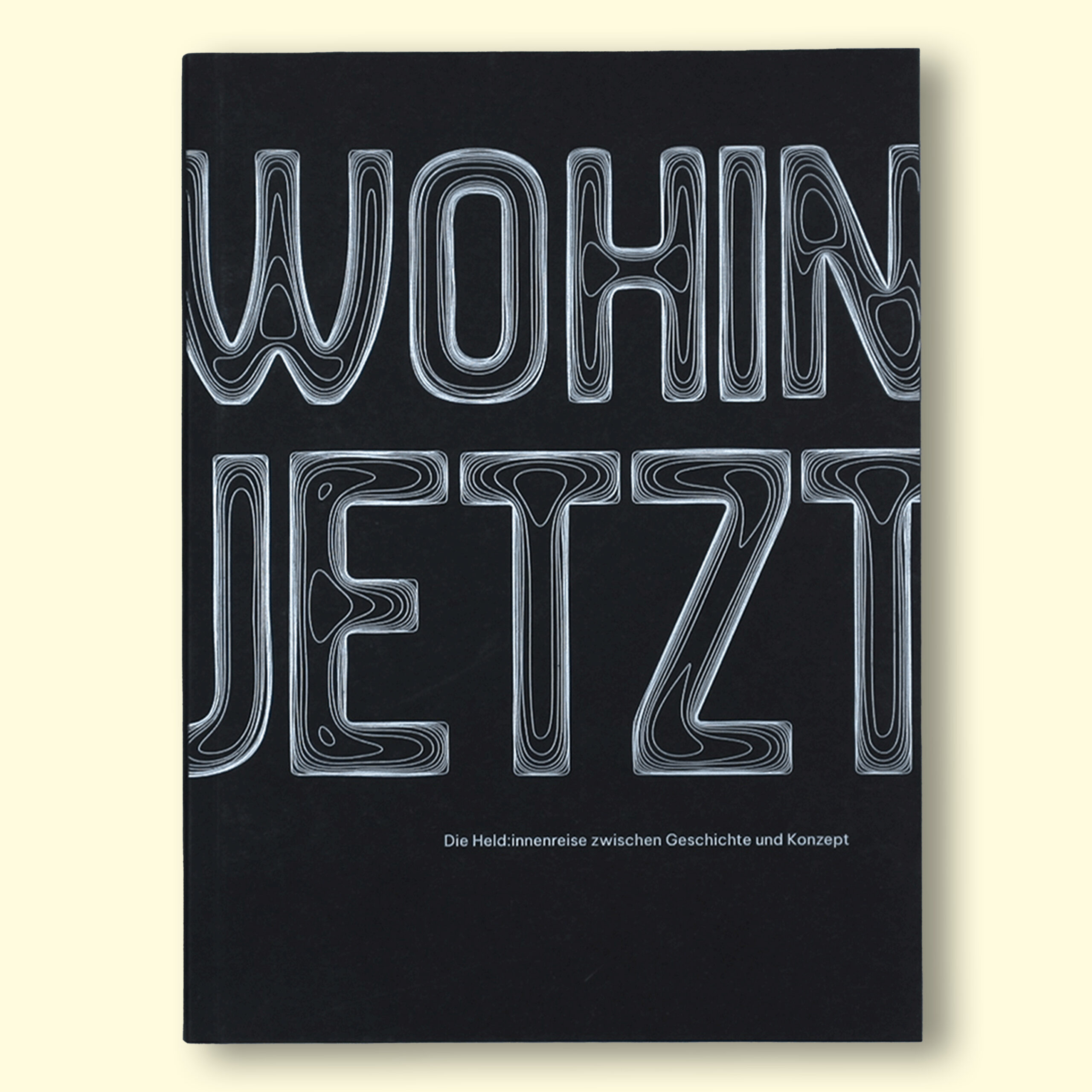
wohin jetzt
This project aims to reinterpret the universal structure of the Hero’s Journey in a personal and abstract way. Told from
the first-person perspective of a fictional protagonist, it reflects on experiences already lived and shares them in an emotional yet universal manner. This creates a dual narrative layer: intimate and individual, but at the same time transferable and broadly meaningful. The familiar structure of a travel guide is deliberately abstracted and transformed into an open, creative format that makes the Hero’s Journey both understandable and tangible.
This project aims to reinterpret the universal structure of the Hero’s Journey in a personal and abstract way. Told from the first-person perspective of a fictional protagonist, it reflects on experiences already lived and shares them in an emotional yet universal manner. This creates a dual narrative layer: intimate and individual, but at the same time transferable and broadly meaningful. The familiar structure of a travel guide is deliberately abstracted and transformed into an open, creative format that makes the Hero’s Journey both understandable and tangible.
Description
The project is an abstract travel guide based on the universal structure of the Hero’s Journey. Told from the perspective of a fictional protagonist, it combines personal reflections with theoretical background. The classical structure of a travel guide is deliberately abstracted and reinterpreted in a free, open design format. Divided into three main parts, the book explores the twelve stages of the journey through narrative texts, visual design, and integrated postcards. Its aim is to make the Hero’s Journey accessible while connecting myth, storytelling, and personal experience. The aim is to make the narrative model of the Hero’s Journey understandable, to highlight its significance in myths and stories, and to create a connection to one’s own life reality.
6th Semester, mar’ 25 – jul’ 25, Graphic design

core Idea
The project reinterprets the Hero’s Journey as an abstract travel guide, combining theory and personal storytelling. It begins by introducing the origins of the model, its role in myths and cultural narratives, and the influence of Joseph Campbell’s work. The main section then follows the twelve stages of the hero’s journey, told through the first-person voice of a fictional protagonist alongside theoretical context. In the final part, the focus shifts to the present and future, reflecting on the relevance of the Hero’s Journey for contemporary life and personal growth.
Design
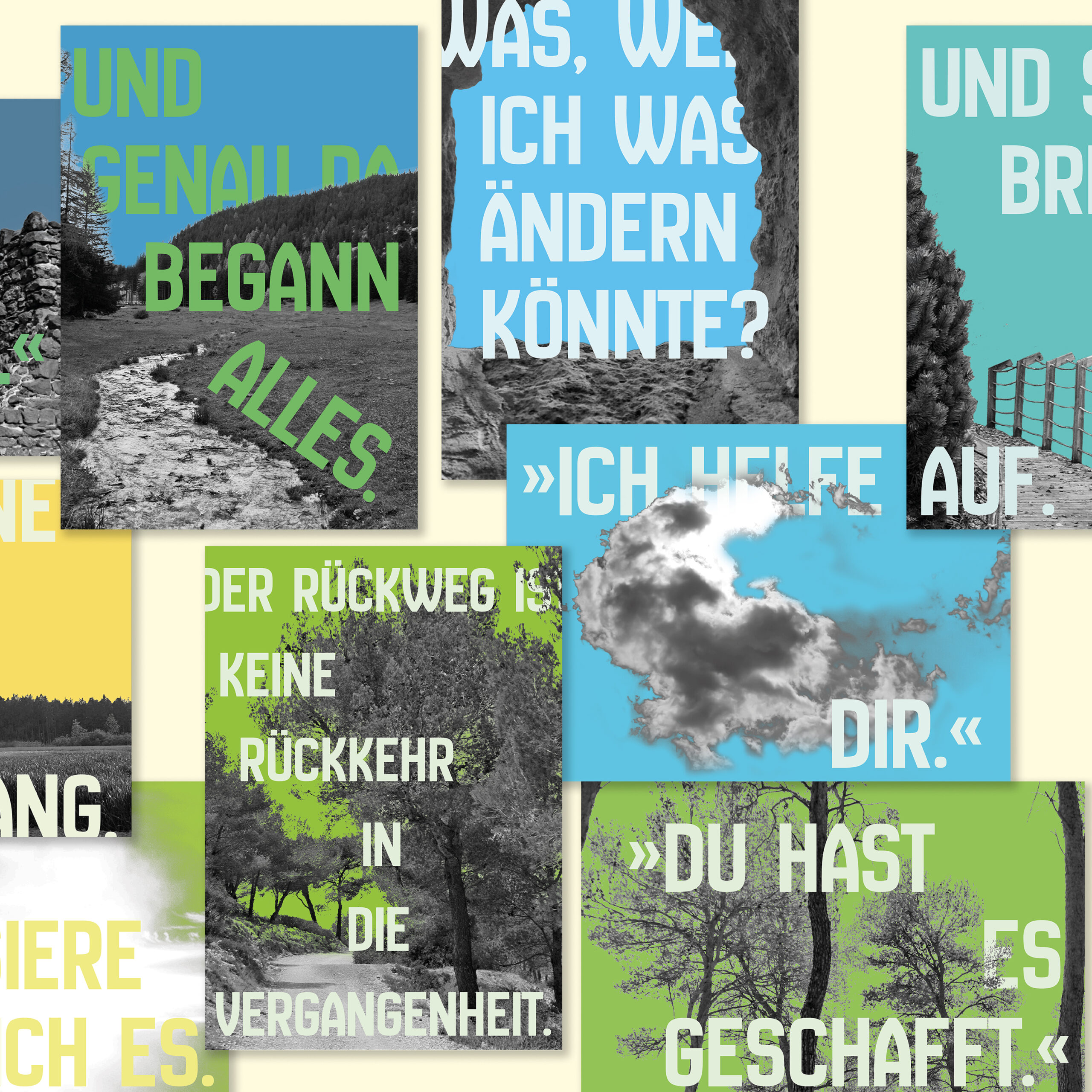
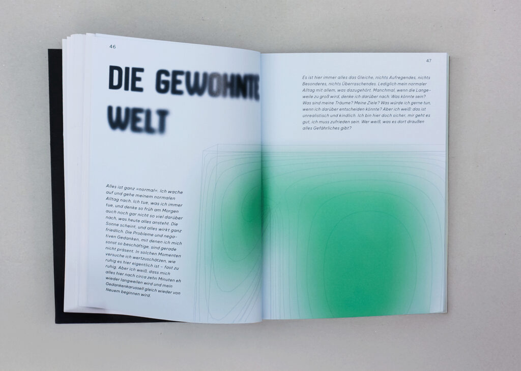
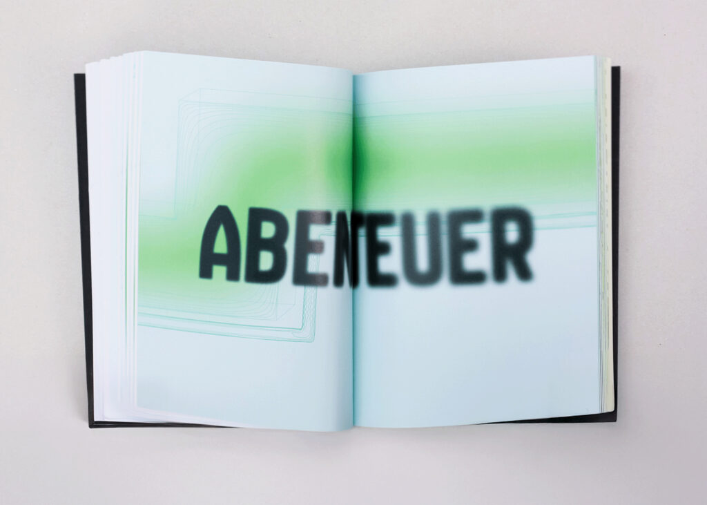
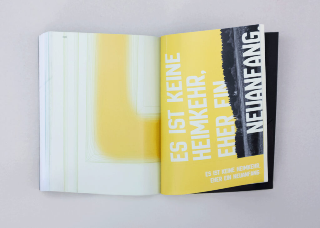
The design combines abstract, mystical aesthetics with precise, cartographic structures. Line graphics are fragmented across the pages, supported by blurred accent surfaces. A strict grid system structures the layout: headers on the left, body text in three to six columns, with page numbers set outside the grid. The bold headers contrast with the clear and calm body text, while italic passages mark the protagonist’s voice. Color evolves throughout the book, reflecting the emotional arc of the journey: from black and white at the beginning, to vibrant greens, and finally to warm oranges and yellows.
Format
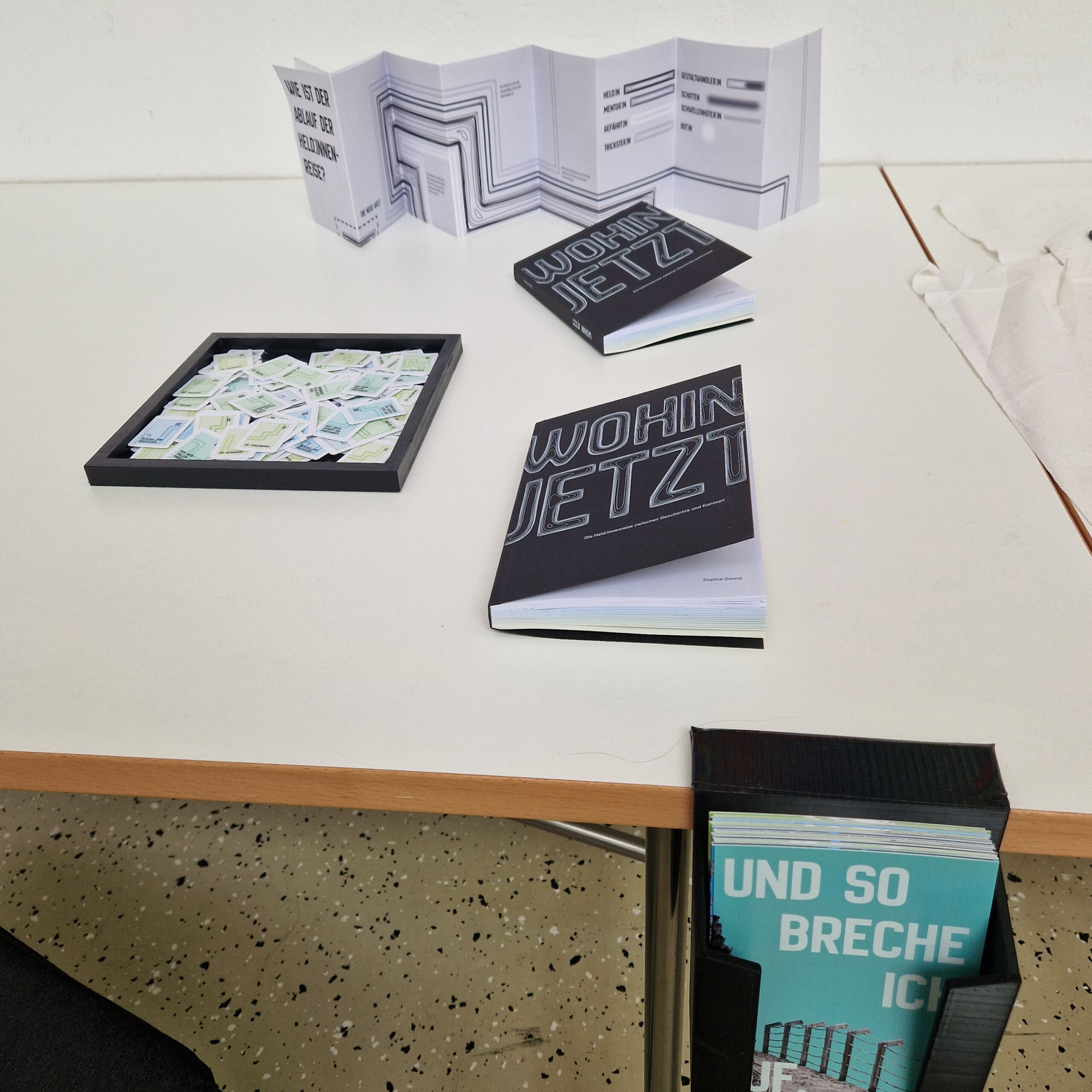
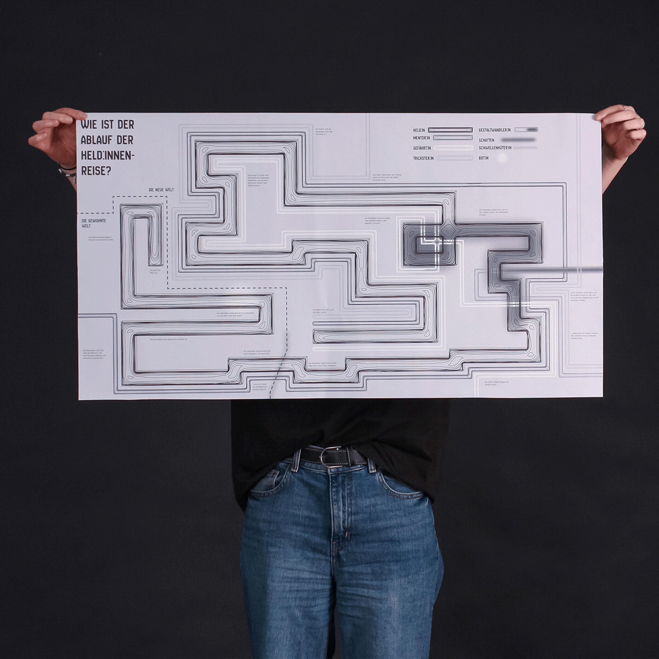
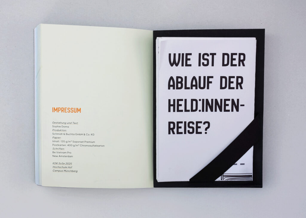
The book was designed in a compact 130 × 180 mm format, offering a comfortable reading experience. This size strikes a balance between portability and presence, underlining the concept of a “travel guide” while keeping it intimate and personal. Integrated postcards, perforated for removal, were adapted from the classic 148 × 105 mm size to fit the book’s layout, ensuring unity while retaining flexibility. Stamps in 21 × 30 mm bring authentic tactile detail, while a large 880 × 480 mm fold-out map at the end of the book provides a visual summary of the Hero’s Journey.
Reproduction
Process
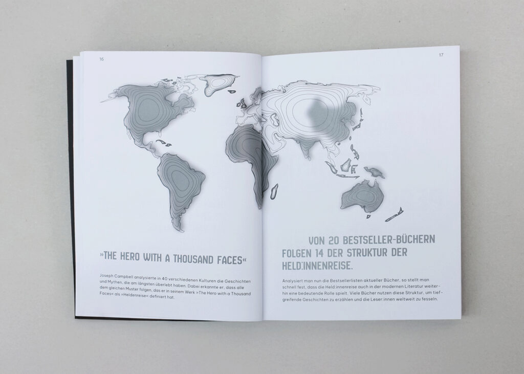
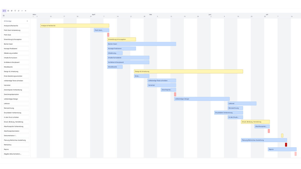
The project started with a research phase, in which I studied Joseph Campbell’s The Hero with a Thousand Faces and The Hero’s Journey: Joseph Campbell on His Life and Work. From this research, I collected and structured the most relevant content and drafted initial outlines, inspired by the format of a traditional travel guide. To make the concept more tangible, I created a pitch deck that visualized structure, mood, and design direction. Moodboards followed, each focusing on different aspects of the journey. These explorations guided the development of two design variants, which ultimately merged into the final concept: a book that balances theory and personal storytelling, structured in three main parts. The design combines abstract line graphics, blurred accent layers, and a clear grid system. Additional tactile elements reinforce the travel guide character and create an interactive reading experience. The project was realized in a small edition and presented in an exhibition setting with books, posters, and interactive elements.
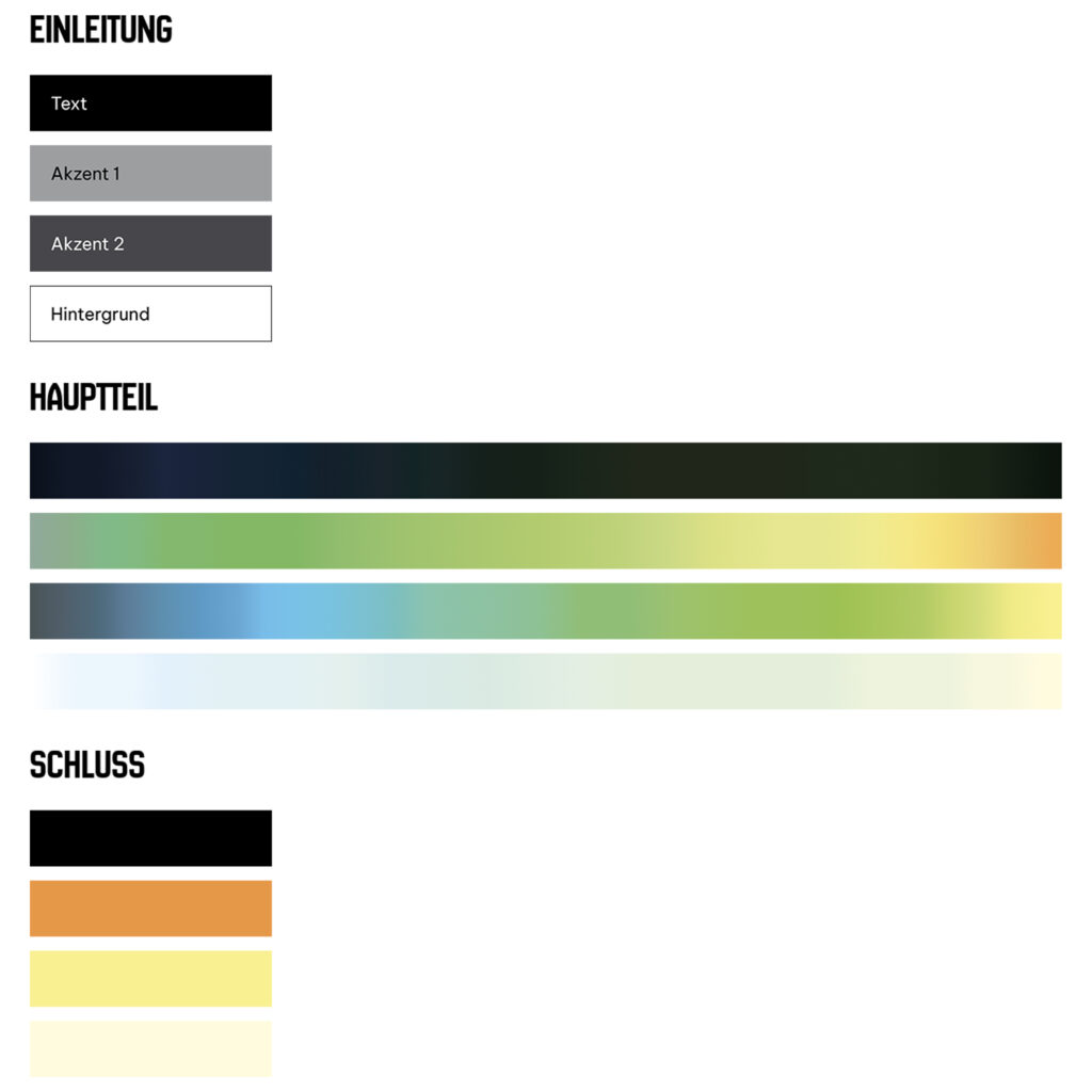
Color concept
The color design follows the emotional arc of the Hero’s Journey, evolving gradually across the book. Around 140 carefully defined shades create subtle transitions and support the narrative flow. Altogether, the colors progress from cool, ordered tones to a vivid, warm palette that mirrors the psychological development of the journey.
Structure
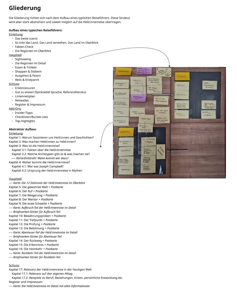
As part of the process, I structured the book into three main sections, while looking at the structure of travel guides: Introduction, Journey, and Conclusion, supported by a register and imprint. The introduction covers theory and cultural context, the main section follows the twelve stages of the Hero’s Journey with paired personal narratives and theoretical spreads, and postcards with stamps are integrated to reinforce the travel guide concept. The conclusion reflects on the journey’s relevance today, providing a clear framework that guided the design and storytelling.
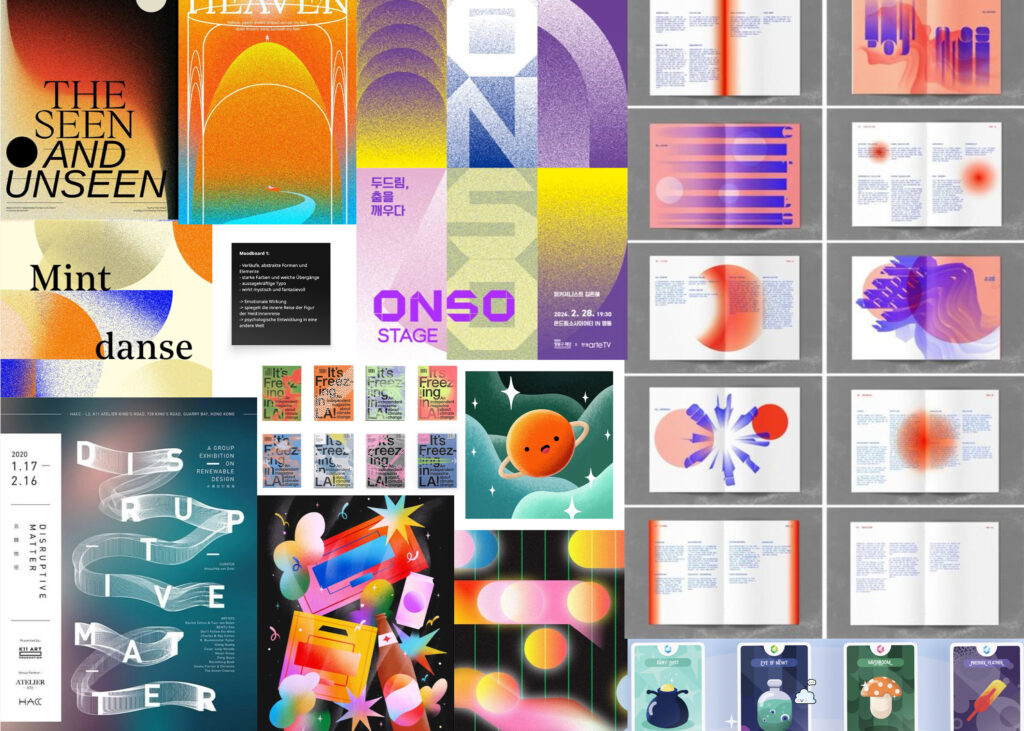
Moodboard
The chosen moodboard emphasizes gradients, abstract forms, and expressive typography. Strong colors with soft transitions create a mystical, imaginative atmosphere. The visual language reflects the inner journey of the protagonist, capturing the emotional and psychological transformation.
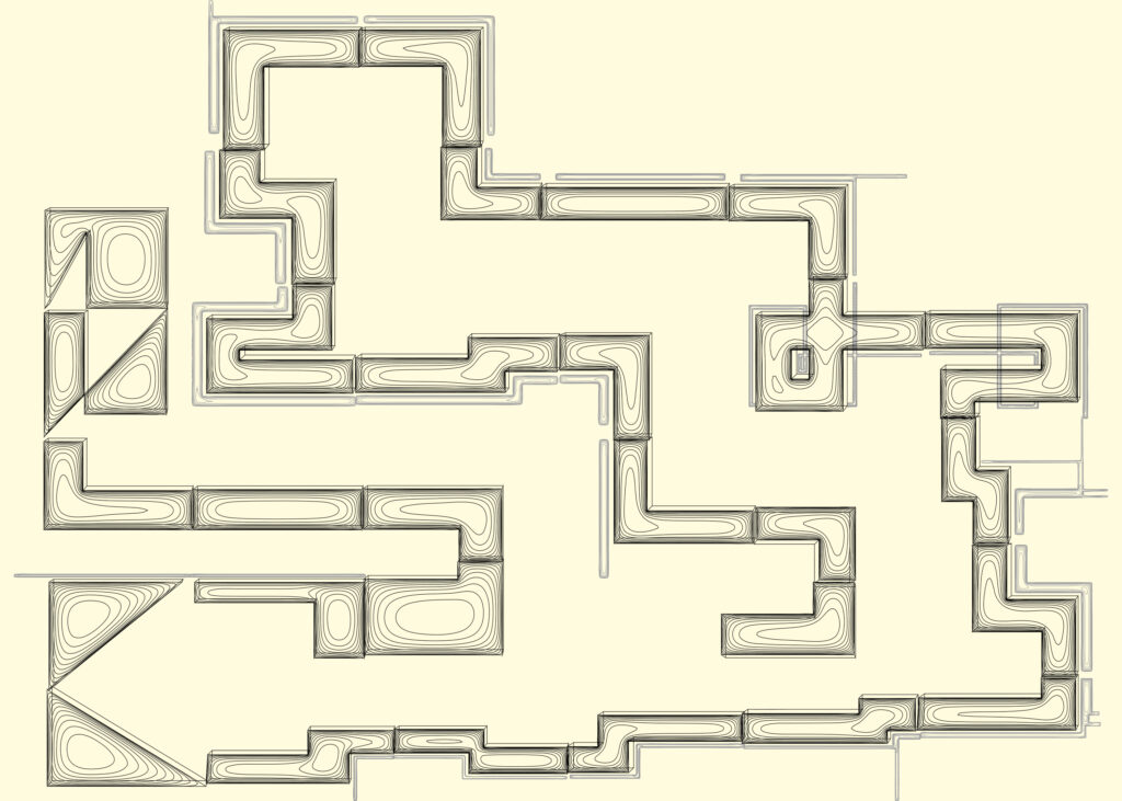
Map
The design of the illustrations is based on line graphics derived from sketches of the Hero’s Journey. The large abstract “map” is divided into individual segments and distributed across the pages of the main section, guiding the visual flow of the book. The introduction and conclusion are primarily typographic, with the map serving as the central illustrative element throughout the journey.
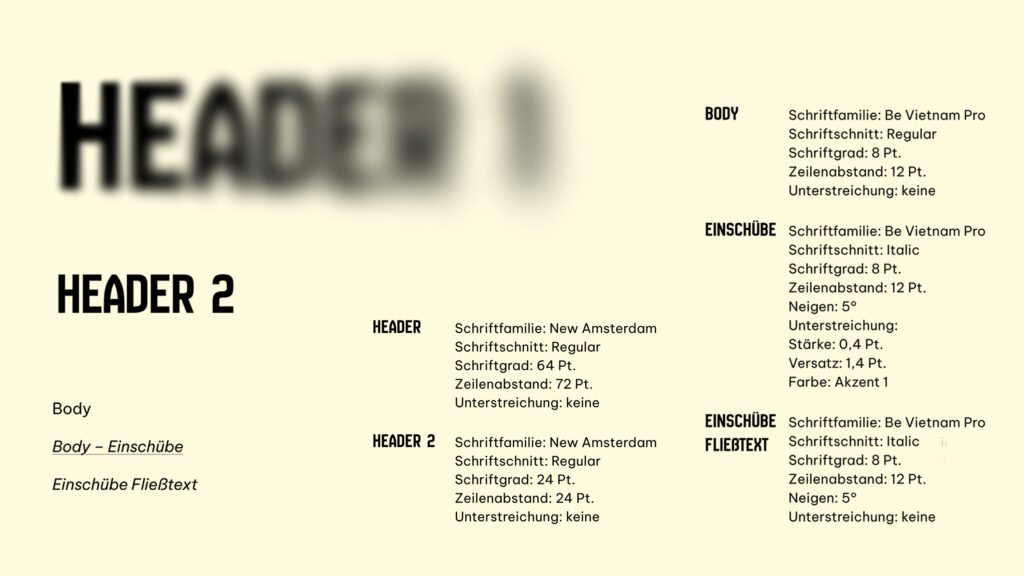
Typography
Headings are bold and prominent, creating a clear visual hierarchy to the calm body text. At the beginning of the book, headers are blurred, gradually becoming sharper as the journey progresses. The main text uses a clean, readable sans-serif typeface for clarity, while headers are set in New Amsterdam and body text in Be Vietnam Pro. Inserts and first-person passages are italicized.
Project Management
The project followed a structured workflow from research and concept development to design and production. Key steps included creating pitch decks and moodboards, developing the book structure and content, designing and refining layouts, preparing print-ready files, and overseeing printing, binding, and exhibition setup. Documentation and project data were finalized as part of the closing phase.
Get in touch!
©Sophie Doma
2025 portfolio
7th semester, hs hof
Communication Design