Slow your scroll
The project
“Slow Your Scroll” focuses on developing an app designed to reduce screen time and support users in leading a digitally balanced life. The app encourages healthier habits in front of screens without inducing feelings of guilt, gently prompting users to reflect on their digital consumption and interrupting prolonged social media use when necessary.
The project “Slow Your Scroll” focuses on developing an app designed to reduce screen time and support users in leading a digitally balanced life. The app encourages healthier habits in front of screens without inducing feelings of guilt, gently prompting users to reflect on their digital consumption and interrupting prolonged social media use when necessary.
Description
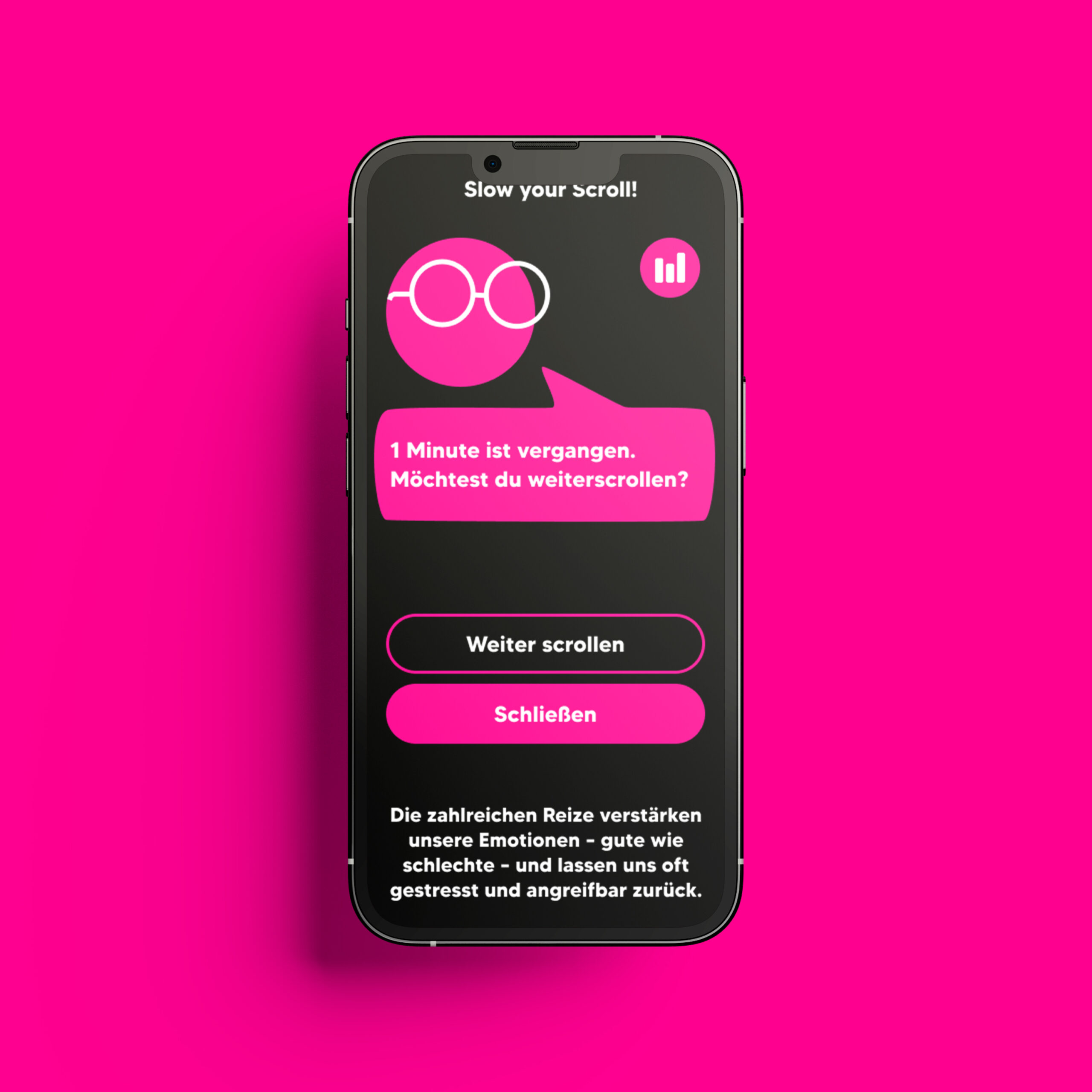
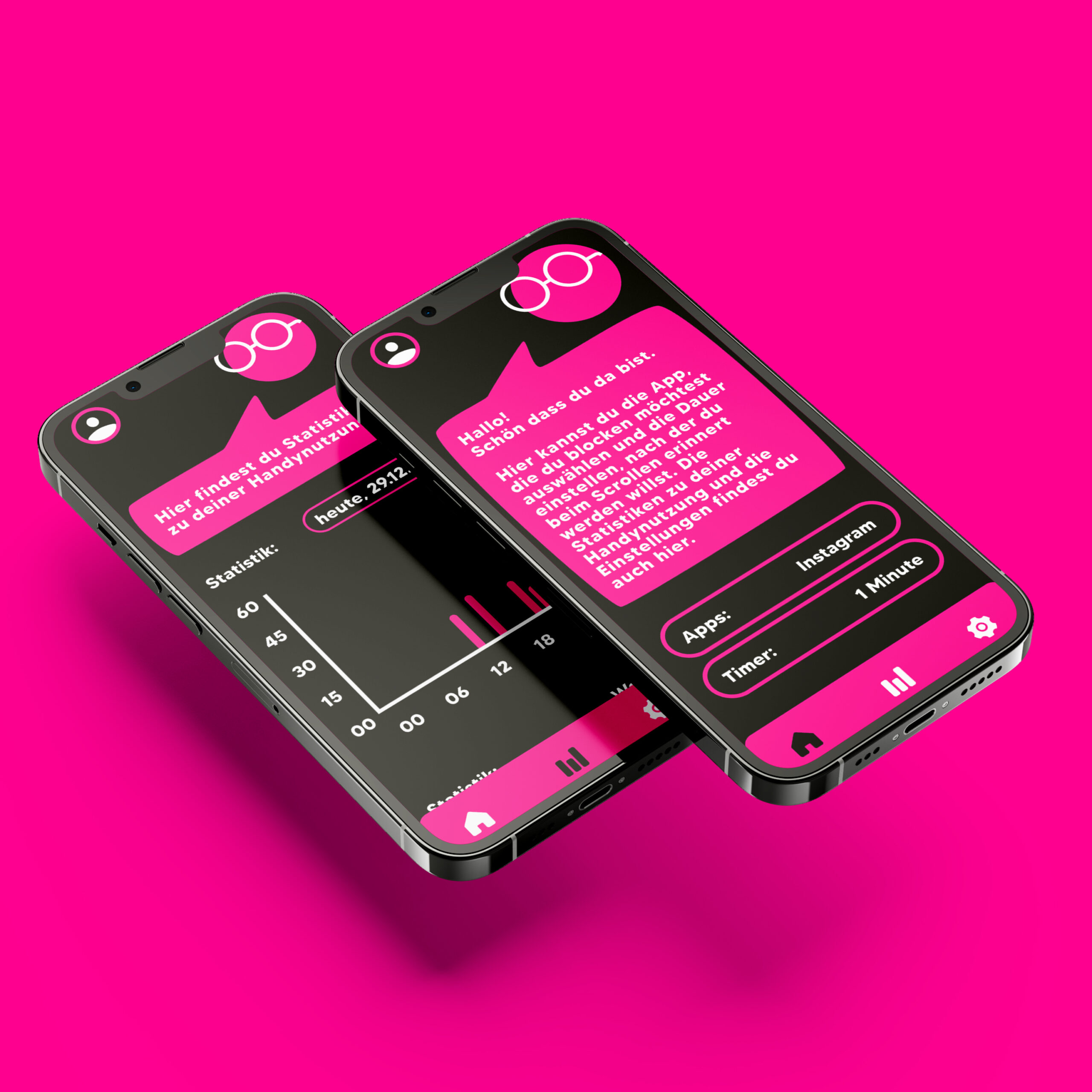
“Slow Your Scroll” is an app designed to help users reduce screen time and cultivate a more balanced relationship with digital devices. The app addresses the common challenge of unconscious and prolonged social media use by gently prompting users to reflect on their intentions before opening an app and providing timed interruptions during scrolling sessions. Beyond simply limiting access, the app emphasizes awareness, self-regulation, and positive reinforcement, offering alternative activities such as music suggestions or brief offline tasks. The design aims to create a supportive environment where users can adjust their habits without feeling guilt or pressure, making behavioral change approachable and sustainable.
3rd Semester, oct’ 23 – feb’ 24, Ux/ui design

core Idea
The concept is to promote intentional use of technology rather than enforcing strict restrictions. The app intervenes in habitual scrolling by prompting users with questions about their purpose for opening a social media app and by providing interruptions after prolonged usage. This approach encourages reflection, self-awareness, and gradual habit change, supporting users in recognizing unproductive patterns and making informed choices. Alternative activities are suggested to redirect attention positively, while maintaining a sense of autonomy.
Users
The primary users of the app are individuals who spend significant time on social media, with a particular focus on students aged 19 to 24. This group often engages in habitual or unintentional usage but simultaneously has a strong motivation to reduce screen time and regain control over their digital habits. Insights from a survey of 42 participants helped identify key behaviors, preferences, and challenges, informing the development of features that address real user needs. Personas were created to represent typical behaviors, goals, and motivations of the target audience.
Methods
The primary users of the app are individuals who spend significant time on social media, with a particular focus on students aged 19 to 24. This group often engages in habitual or unintentional usage but simultaneously has a strong motivation to reduce screen time and regain control over their digital habits. Insights from a survey of 42 participants helped identify key behaviors, preferences, and challenges, informing the development of features that address real user needs. Personas were created to represent typical behaviors, goals, and motivations of the target audience.
Screencast
Process
The app development followed a structured process combining research, design, and testing. It began with a survey of 42 participants to understand screen time habits and user needs. Personas and user journeys were then created to visualize behaviors and guide feature prioritization. Wireframes established layout, hierarchy, and navigation, while moodboards explored visual style and engagement strategies. Two design variants were developed: one focused on lines and filled shapes, the other on colorful elements and a protagonist. Iterative user testing refined button designs and dashboard layout, ensuring usability and clarity. Each method informed design decisions, resulting in an intuitive, visually cohesive app that supports mindful, balanced digital habits.
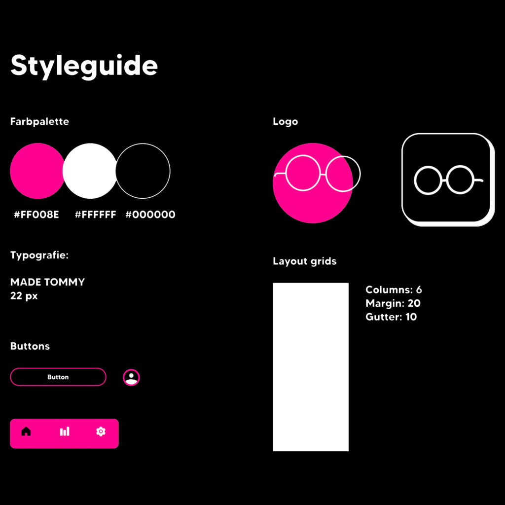
Styleguide
The styleguide defines a consistent visual identity. The color palette consists of black and white, complemented by pink as a accent color that highlights key elements and interactions. Typography is set in “Made Tommy” at 22pt, chosen for its readability and modern aesthetic. The logo is based on the glasses of the app’s protagonist, creating a playful and recognizable brand symbol. For layout, a 6-column grid was applied, ensuring a structured and balanced design across all screens.
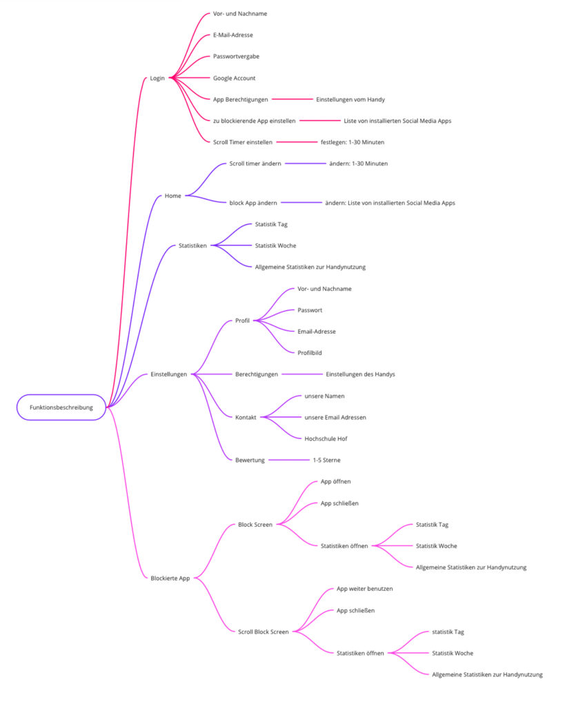
Function Map
The function map outlines all essential features designed to support the needs of the personas. It includes prompts before opening social media apps, timers to track usage, blocking functions after prolonged scrolling, and suggestions for alternative activities such as music or offline tasks. Alongside these core functions, it also defines supporting elements like dashboard navigation and customizable settings. By organizing features in this way, the map helped in the research and design phase, ensuring that user needs were addressed and providing a clear basis for developing wireframes.
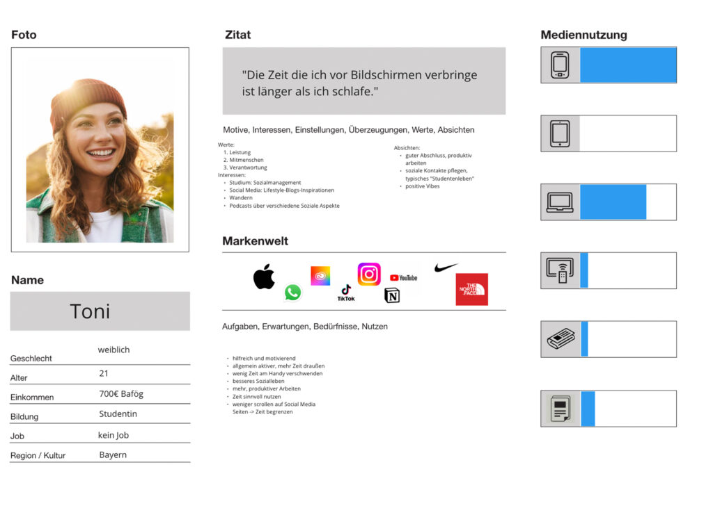
Persona
Two personas were developed to represent the target audience. They capture details such as routines, motivations, and frustrations related to social media use. By grounding the design in these personas, the project could address realistic needs and ensure that the app’s features resonate with users and their experiences.
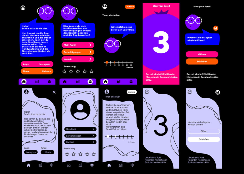
Design variants
Two design variants were created during the exploration phase. The first, inspired one of the moodboards, worked primarily with lines and filled shapes, resulting in a clean and structured appearance. The second, based on another moodboard, introduced colorful elements and a character protagonist, combining bold shapes and playful accents to create a more dynamic atmosphere. These variants allowed for comparison of tone and engagement, ultimately guiding the refinement of the final visual direction.
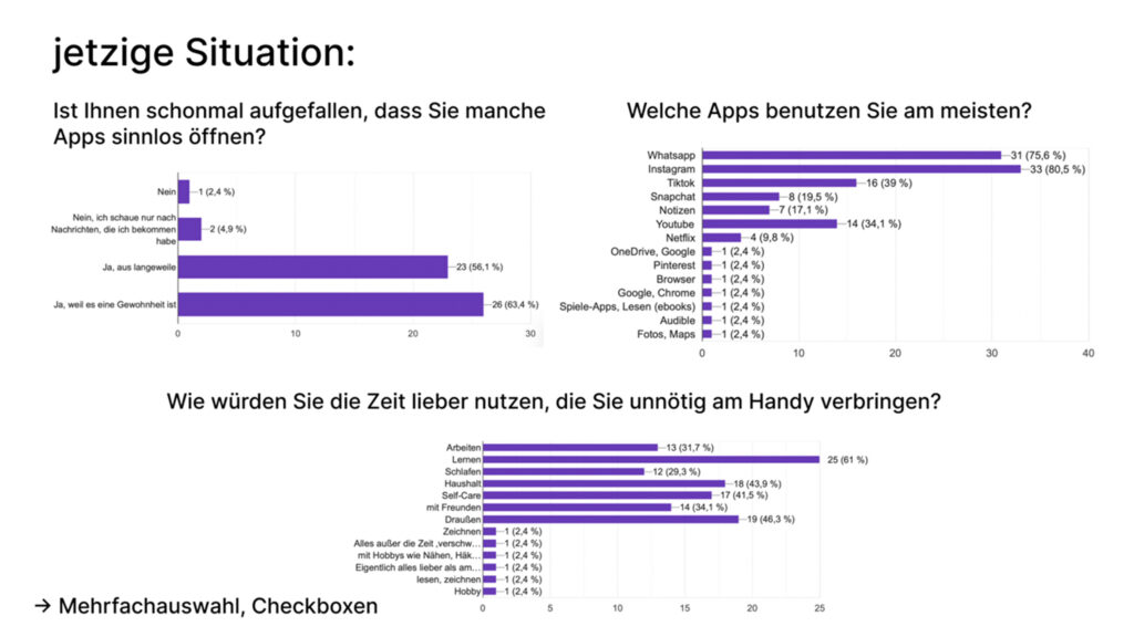
Survey
A survey formed the foundation of the user research. It was divided into three sections: identifying the target audience, analyzing the current situation regarding screen time, and gathering feedback on app concepts. The results provided valuable insights into user habits and expectations. After iterations, the survey was revised and optimized, ensuring more precise questions and relevant data for the design process.
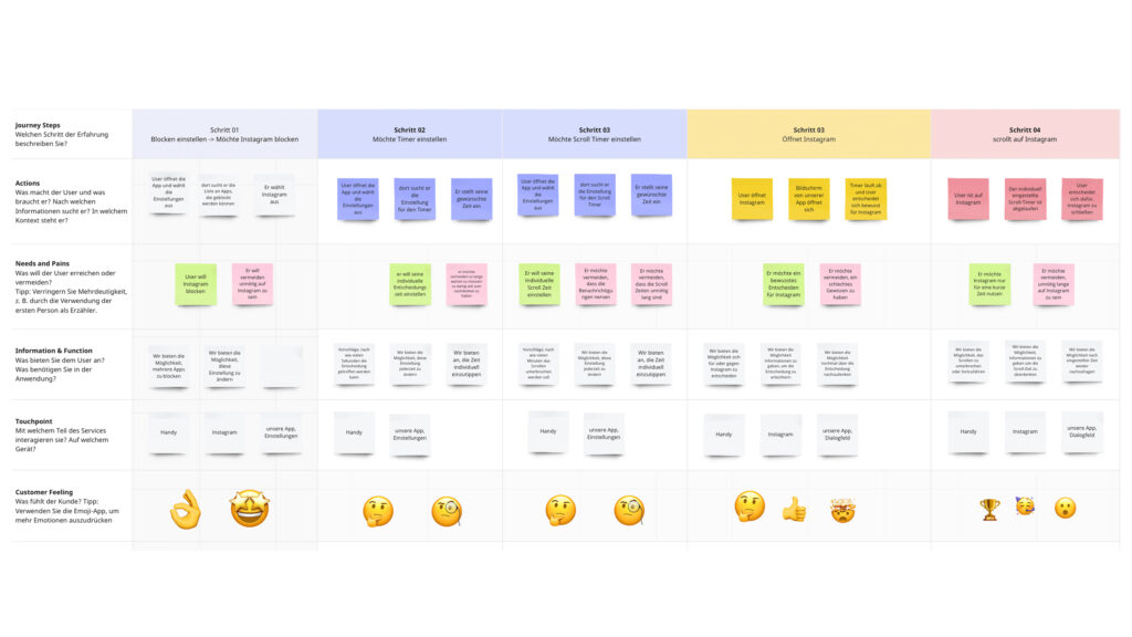
User Journey
User stories and journeys were created for each persona to map out typical interactions with the app. These journeys highlighted user goals, steps, and possible obstacles, making it easier to identify which functions were necessary and how they should be presented. The user journeys served as a practical tool to translate abstract user needs into concrete design elements, directly informing the development of features and wireframes.
Get in touch!
©Sophie Doma
2025 portfolio
7th semester, hs hof
Communication Design