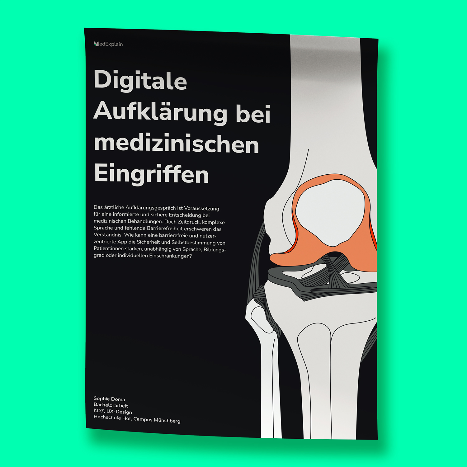
MedExplain
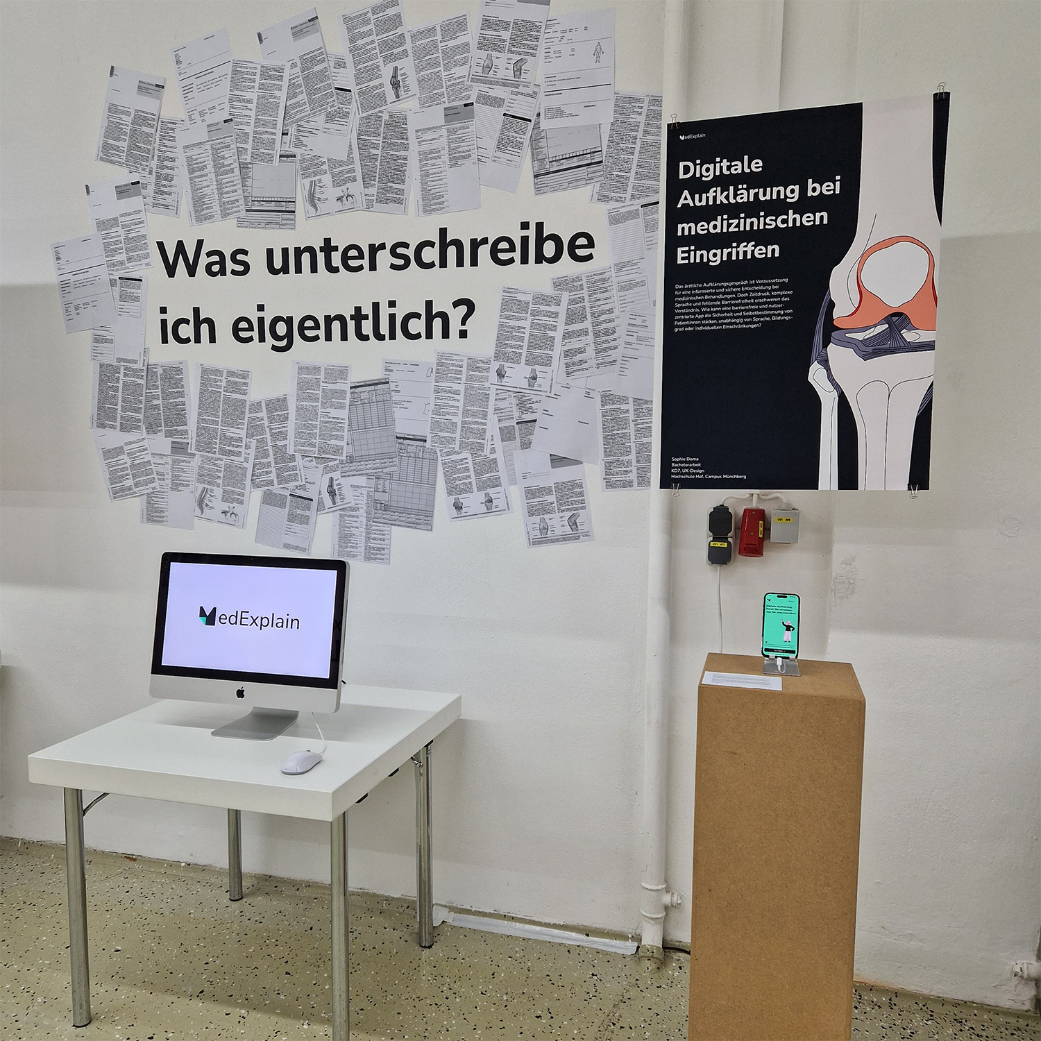
This project explores how medical informed consent can be made more accessible and understandable for patients.
Developed in collaboration with medical specialists in anesthesiology, trauma surgery, orthopedics, and internal medicine, the concept addresses a common challenge in healthcare communication: the informed consent conversation is essential for safe medical decision-making, yet time pressure, complex terminology, and limited accessibility often make it difficult for patients to fully understand.
This project explores how medical informed consent can be made more accessible and understandable for patients. Developed in collaboration with medical specialists in anesthesiology, trauma surgery, orthopedics, and internal medicine, the concept addresses a common challenge in healthcare communication: the informed consent conversation is essential for safe medical decision-making, yet time pressure, complex terminology, and limited accessibility often make it difficult for patients to fully understand.
Description
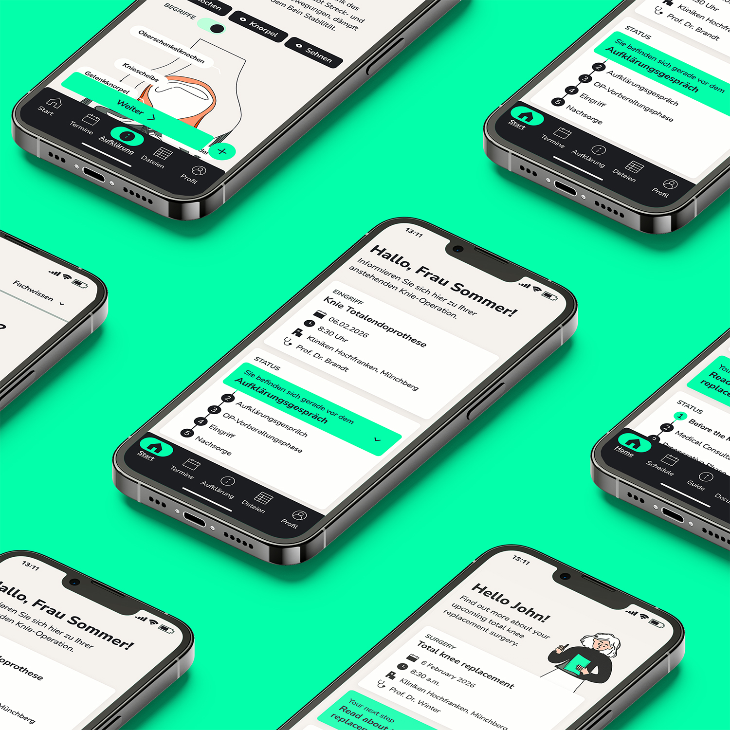
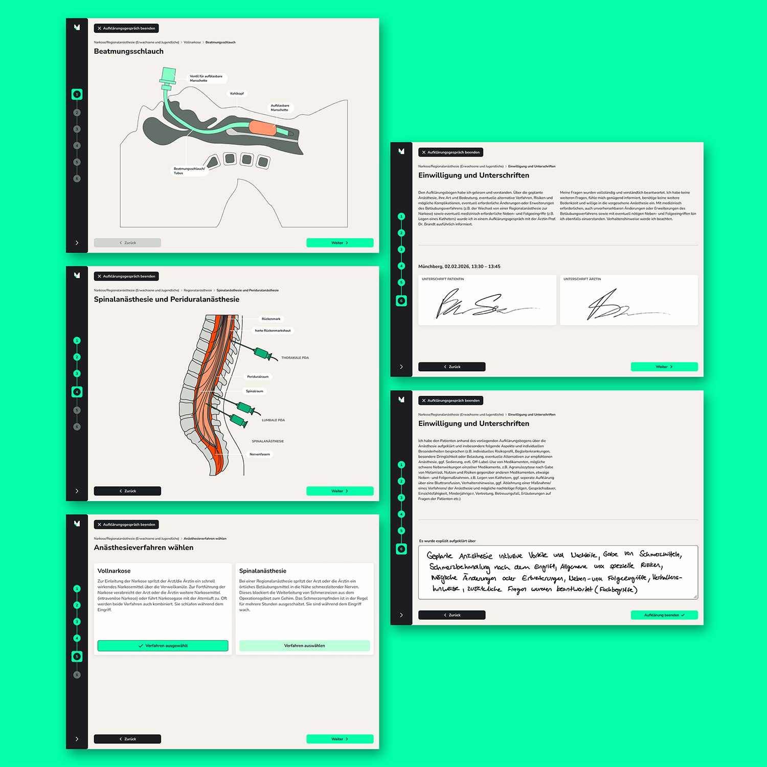
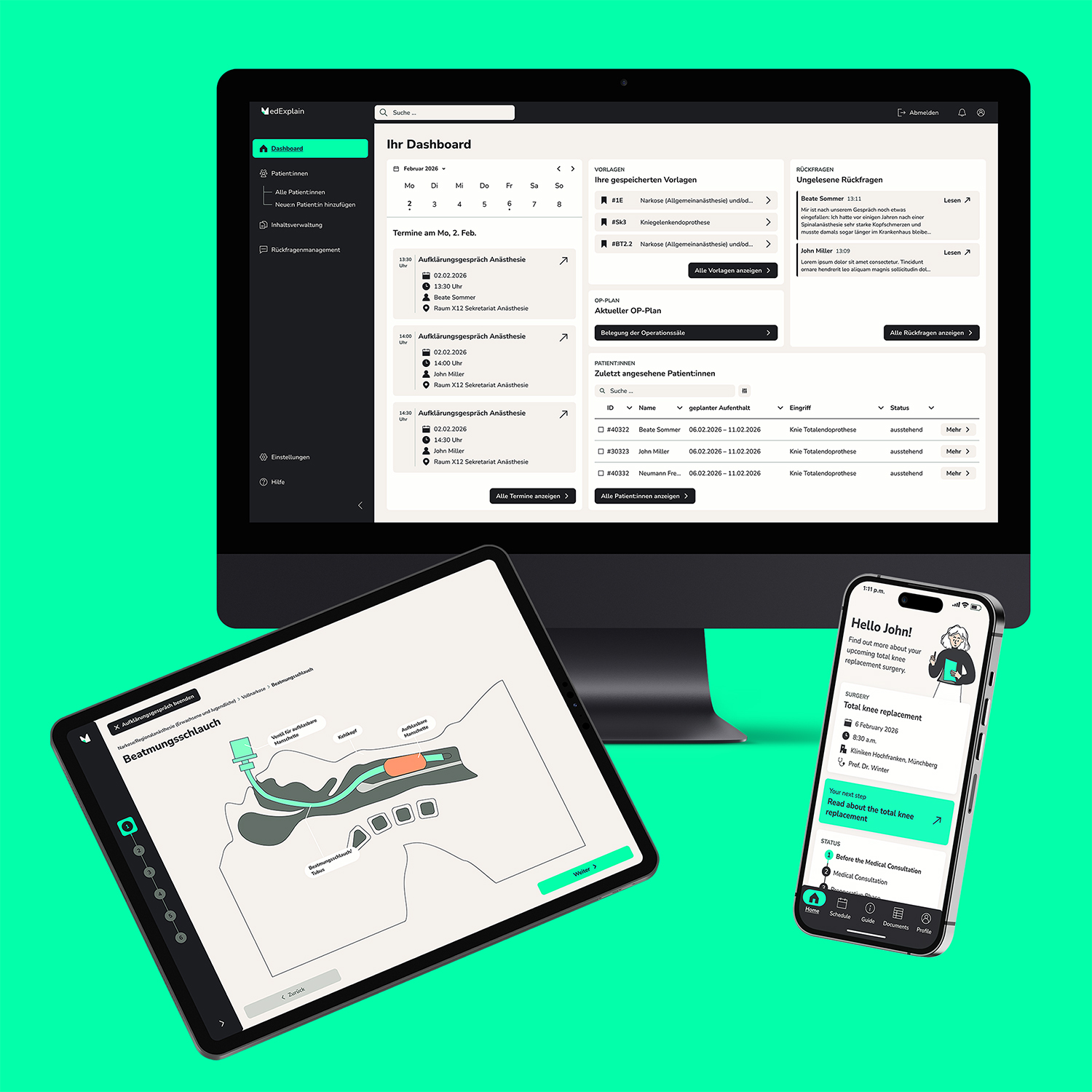
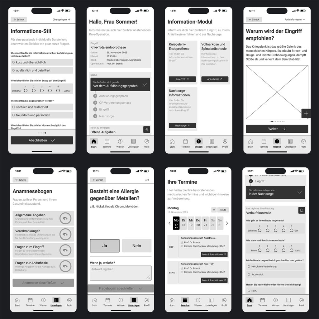
MedExplain is an accessible digital application designed to support patient education before medical procedures, focusing on the fields of anesthesiology and orthopedics. The project addresses planned, inpatient procedures and aims to prepare patients for the informed consent conversation and the upcoming treatment in an accessible and understandable way. The application provides multilingual, inclusive, and easy-to-understand information through visual, textual, and audio-based explanations. Features such as simplified language, multilingual support, and personalized information modules help translate complex medical content into clear and accessible formats. This allows patients to better understand the procedure, feel more confident in the consent process, and receive continued guidance during the postoperative care phase.
7th Semester, oct’ 25 – feb’ 26, Ux/ui design
core Idea
The core idea of MedExplain is to make medical informed consent more understandable and inclusive. Medical explanations are often complex and not adapted to the knowledge level of non-experts, which can lead to misunderstandings, uncertainty, and difficulties in making informed decisions. The project therefore focuses on an accessible, user-centered approach that translates complex medical information into clear and supportive formats. By supporting doctors during the consent process and helping patients better understand procedures, MedExplain aims to enable more confident and informed treatment decisions.
Users
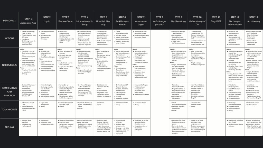
The project considers two primary user groups: patients and administrative users. Administrative users include doctors, medical staff, as well as hospital stakeholders such as management and quality management teams who oversee and support the consent process. The main focus, however, lies on patients preparing for a medical procedure and the required informed consent conversation. To better understand their needs and contexts, several personas were developed and used as the foundation for the design process and project development.
Accessibility
Accessibility is a core principle of the project. Features such as simplified language, multilingual support, and visual and audio-based explanations help make medical information understandable for people with different abilities and backgrounds. Particular attention was also given to clear typography, high readability, and sufficient color contrast to ensure the interface is easy to perceive and navigate. The goal is to create a more inclusive informed consent process that enables patients to participate in medical decisions with greater confidence and independence.
Screencast
Process
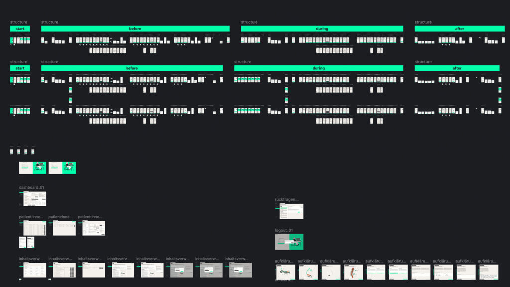
The design process followed a user-centered UX approach and combined research, analysis, and iterative design methods. To better understand current challenges in medical informed consent, a survey and expert interviews with healthcare professionals were conducted, providing insights into communication barriers, time constraints, and patient needs. Based on these findings, personas and archetypes were developed to represent the main user groups and guide design decisions. The user perspective was further explored through Jobs-to-Be-Done, user stories, and user journeys, helping to identify key interaction points throughout the patient experience before, during, and after the medical procedure. These insights informed the creation of user flows and wireframes, which structured the application and its core features. The prototype was then evaluated through user testings, allowing iterative improvements and ensuring that the solution effectively supports both patient understanding and the consent process.
Wireframes
Based on the previously developed user stories, initial wireframes were created to visualize key usage scenarios, tailored to the specific tasks and needs of the primary user group. These wireframes illustrate core functions, such as the dashboard and medical information pages. They were tested through user testings to validate usability and refine interactions.
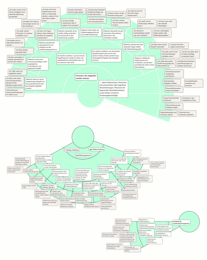
Jobs to be Done
The Jobs-to-be-Done framework by Anthony Ulwick was used to define the needs and goals of all user groups. Patients were identified as the primary job executors, while other roles complement the framework by shaping purchase decisions and supporting the product throughout its lifecycle. This approach ensured a clear understanding of who performs which tasks and how the system can best support them.
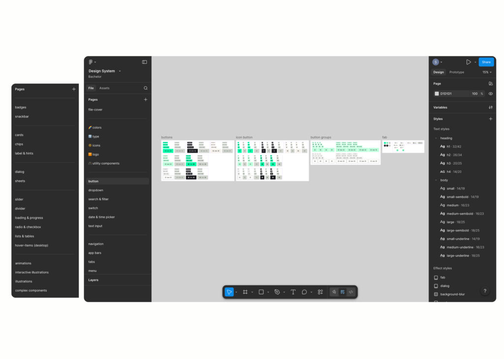
Design System
The design was built component-based, ensuring scalability and consistency. It consists of two parts: the main design file and the design system file. The design system includes all components, from basic elements like buttons to more complex components and animations.
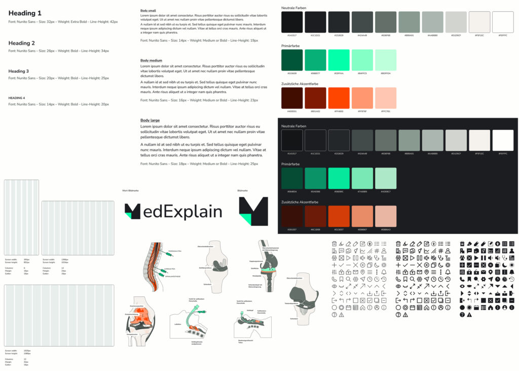
Styleguide
The styleguide is built on the Nunito Sans typeface and includes 7 text variants. The color system combines 10 grayscale tones with one primary color for navigation states and primary actions, a complementary color for warnings, and an additional accent color for illustrations. A custom icon set was developed in four sizes, each available in filled, outline, and bold outline versions. For mobile layouts, a six-column grid was chosen to ensure flexibility and consistency.
User Journey
The user journeys were developed for each persona, based on real workflows. Each journey was structured into three phases: before the medical consultation, between consultation and surgery, and after the surgery (follow-up care). A total of four user journeys were created, which then served as the foundation for user flows and user stories that informed the wireframes.
Figma-File
The design was realized in Figma using a component-based approach with reusable elements, variables, and styles for consistency and scalability. The interface prioritizes patients as the primary user group, while also accommodating admin functions. This ensures a role-specific experience within a unified, coherent design.
Get in touch!
©Sophie Doma
2025 portfolio
7th semester, hs hof
Communication Design