Antrieb
This book project explores how everyday objects can inspire positivity and productivity. Many people often face periods of negativity or lack of drive, which not
only affects their own productivity but can also influence their social environment. The project responds to this issue by creating a resource that collects objects people can turn to when they need encouragement. These objects act as small reminders of energy, movement, and positivity, helping readers to reframe their mindset and shift their focus away from difficulties toward possibilities.
This book project explores how everyday objects can inspire positivity and productivity. Many people often face periods of negativity or lack of drive, which not only affects their own productivity but can also influence their social environment. The project responds to this issue by creating a resource that collects objects people can turn to when they need encouragement. These objects act as small reminders of energy, movement, and positivity, helping readers to reframe their mindset and shift their focus away from difficulties toward possibilities.
Description
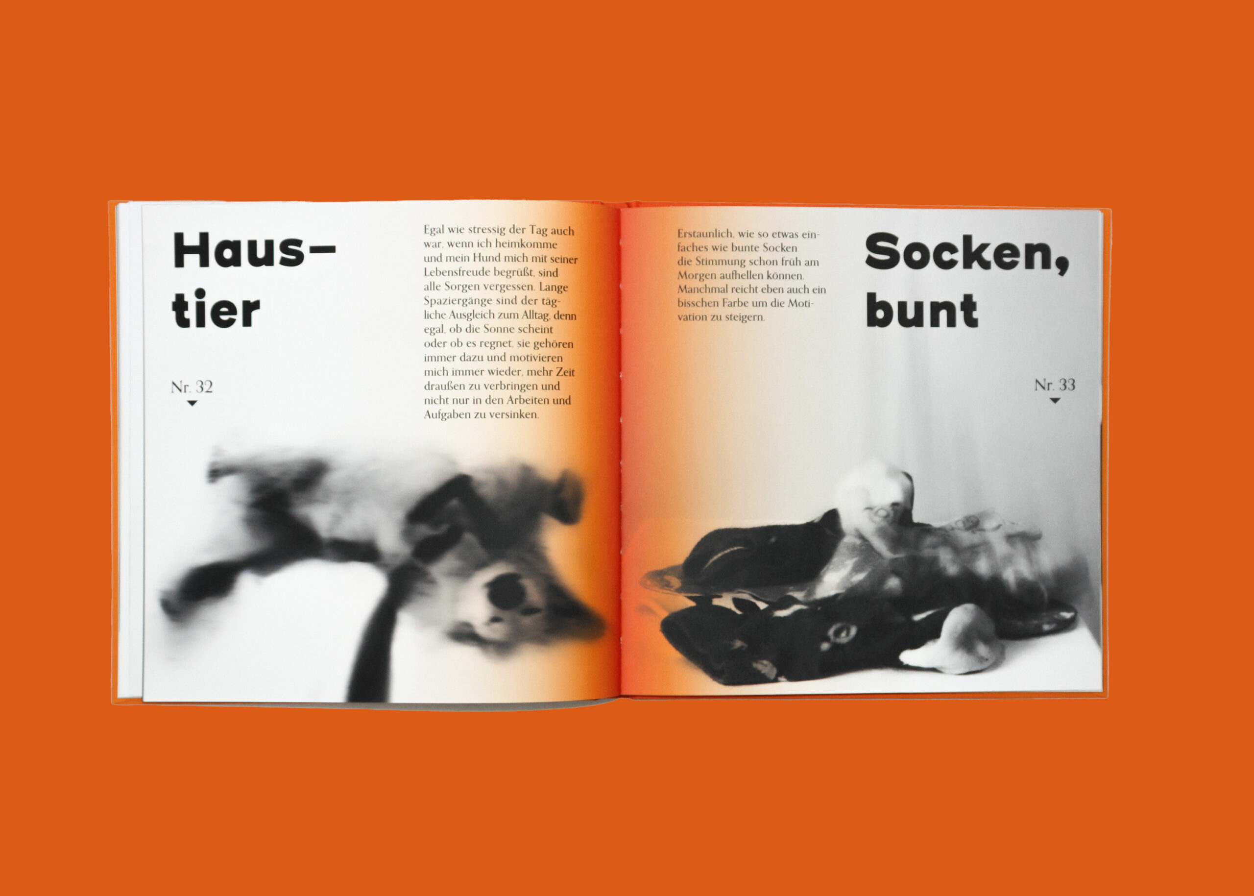
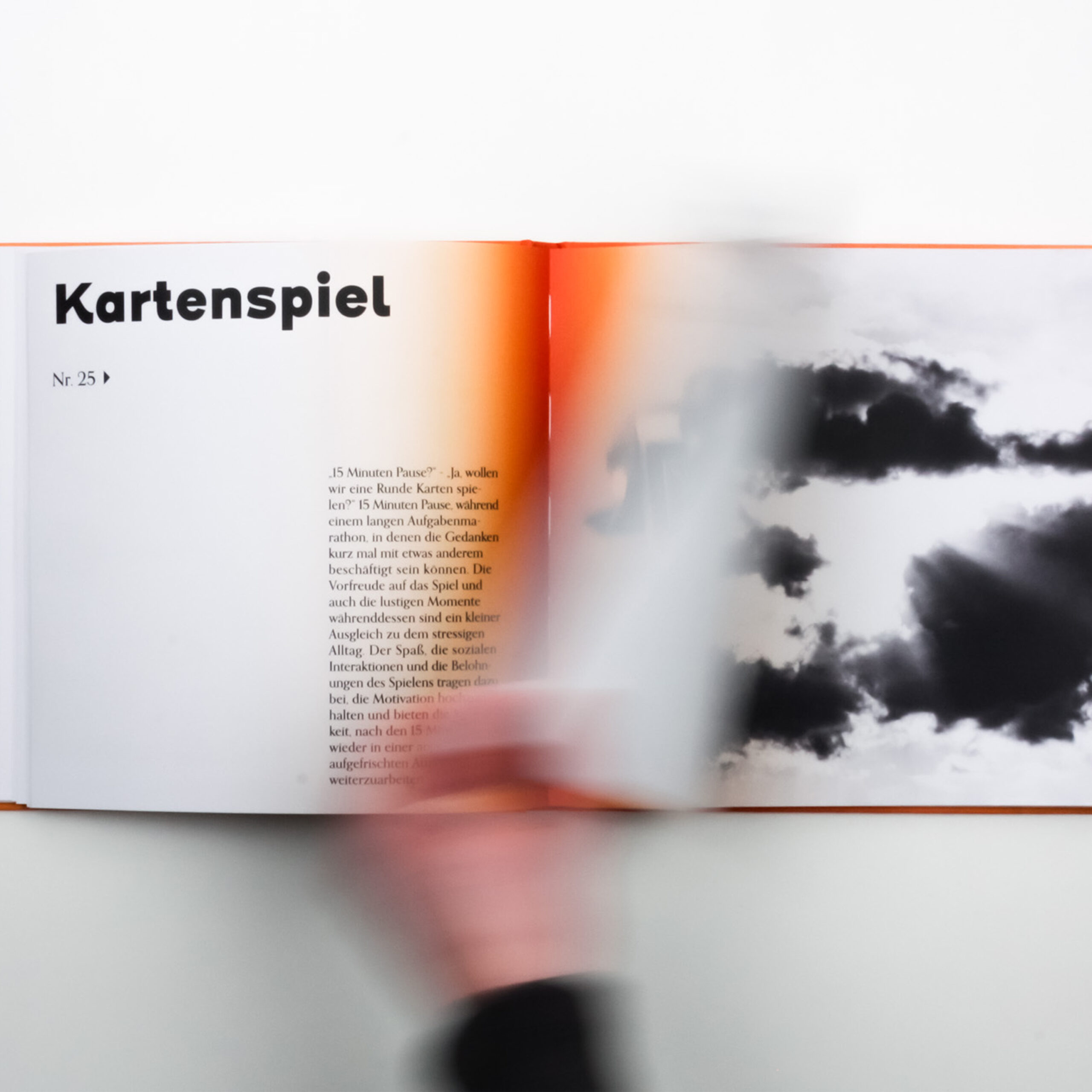
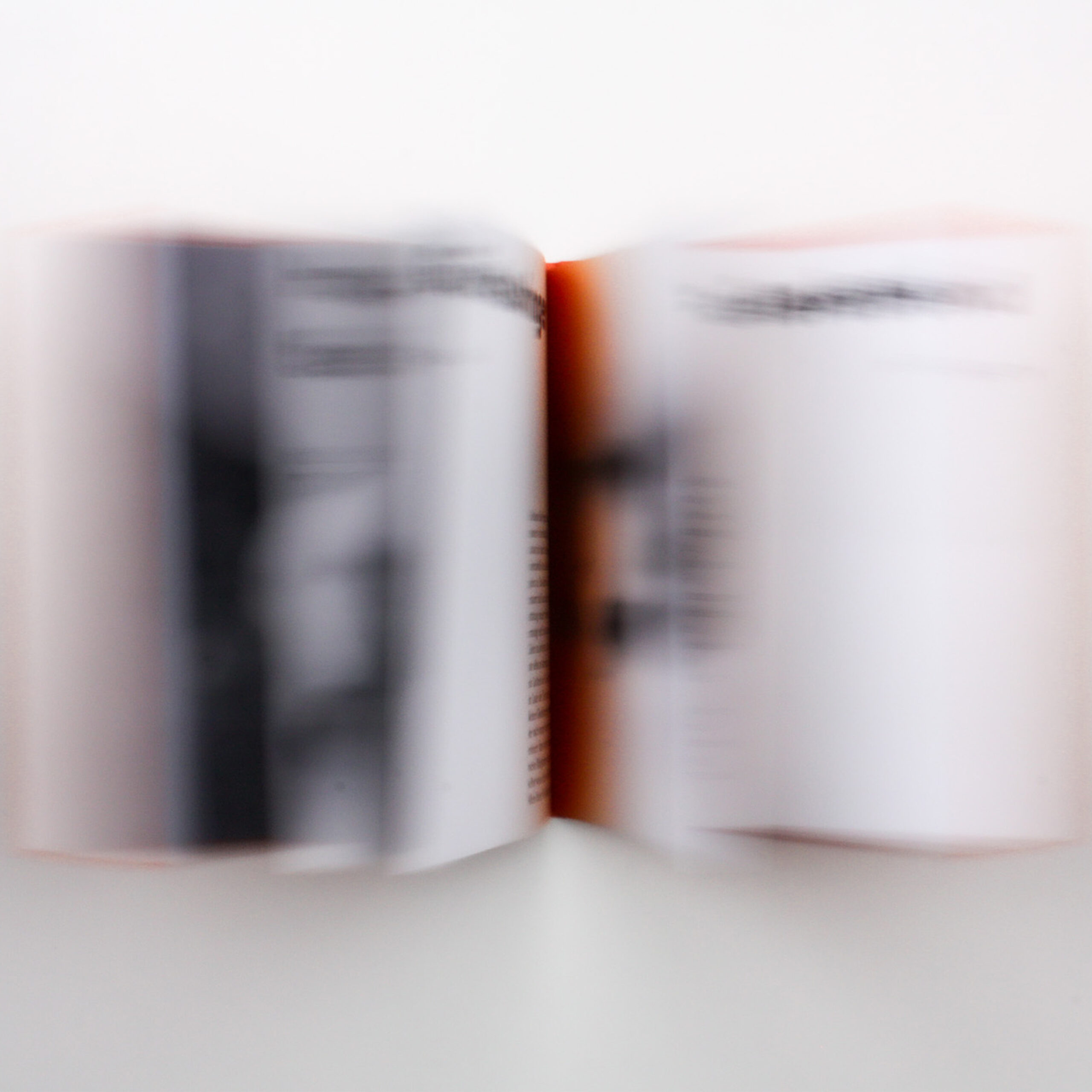
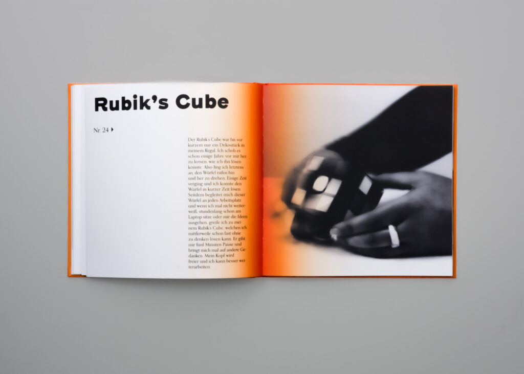
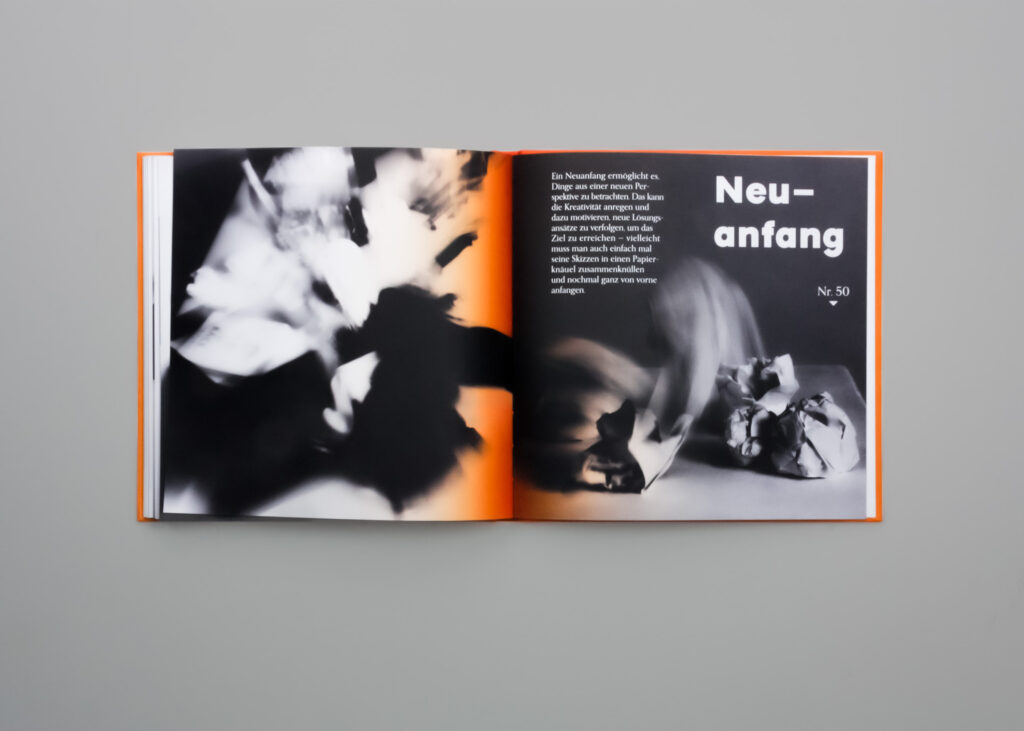
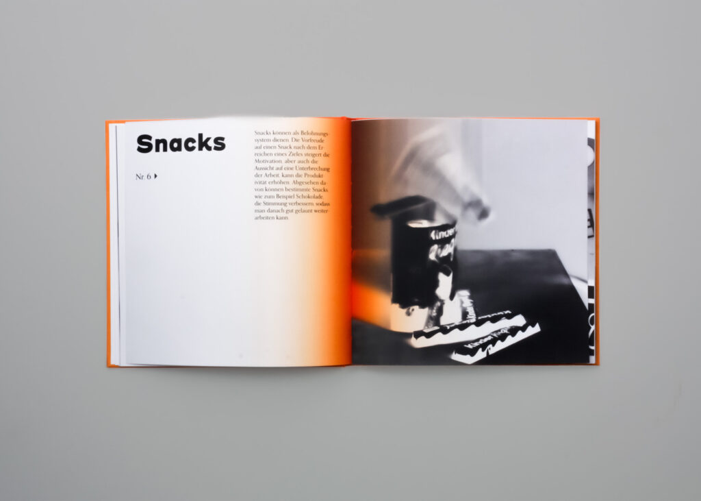
The book collects 50 objects and situations that serve as motivational triggers, supported by short texts, quotes, and visual elements. Its aim is to offer a resource that people can turn to whenever they feel unmotivated, helping them to reframe tasks and approach them with a more positive mindset. The design plays a crucial role in conveying the project’s idea: instead of static illustrations, blurred photographs are used to visually represent momentum, energy, and the fluid nature of motivation itself. By blending personal stories, symbolic objects, and expressive visuals, Objects of Drive becomes both a source of inspiration and a practical tool for fostering positivity and productivity in daily life.
3rd Semester, oct’ 23 – feb’ 24, Editorial design
core Idea
The project is about shifting perspectives and counteracting the widespread tendency to approach tasks with negativity or lack of drive. By collecting everyday objects as symbols of energy and momentum, the book encourages readers to focus on positive aspects rather than obstacles. The aim is not only to support individuals in finding motivation but also to have a broader societal impact: more positivity leads to greater productivity and healthier interactions within communities. The target group includes anyone facing daily tasks, making the book a universally accessible tool.
Layout
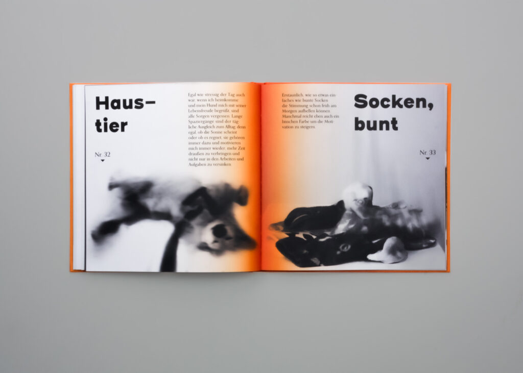
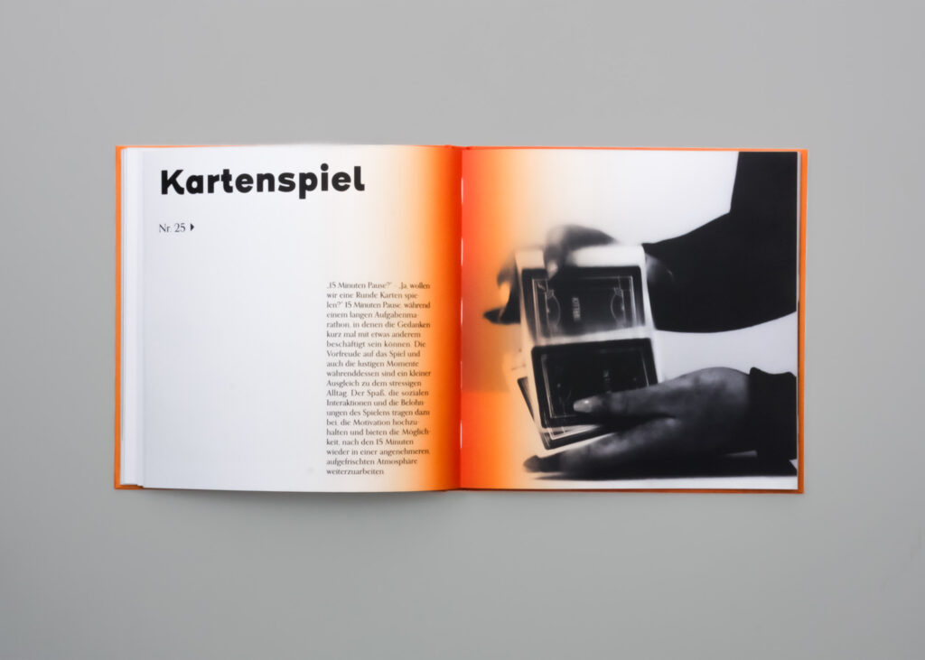
The layout follows a grid that structures the 50 objects and situations. The book opens with a table of contents and an introductory section, including a full-page image and five guiding questions. Each object is presented with a title and accompanying text; depending on the content, this can appear alongside an image or as text-only when visuals are not suitable. Placement is guided by a small arrow, indicating whether the corresponding photo is on the same page, on the facing page, or following on the next page. This system creates rhythm and variation while maintaining orientation.
Production
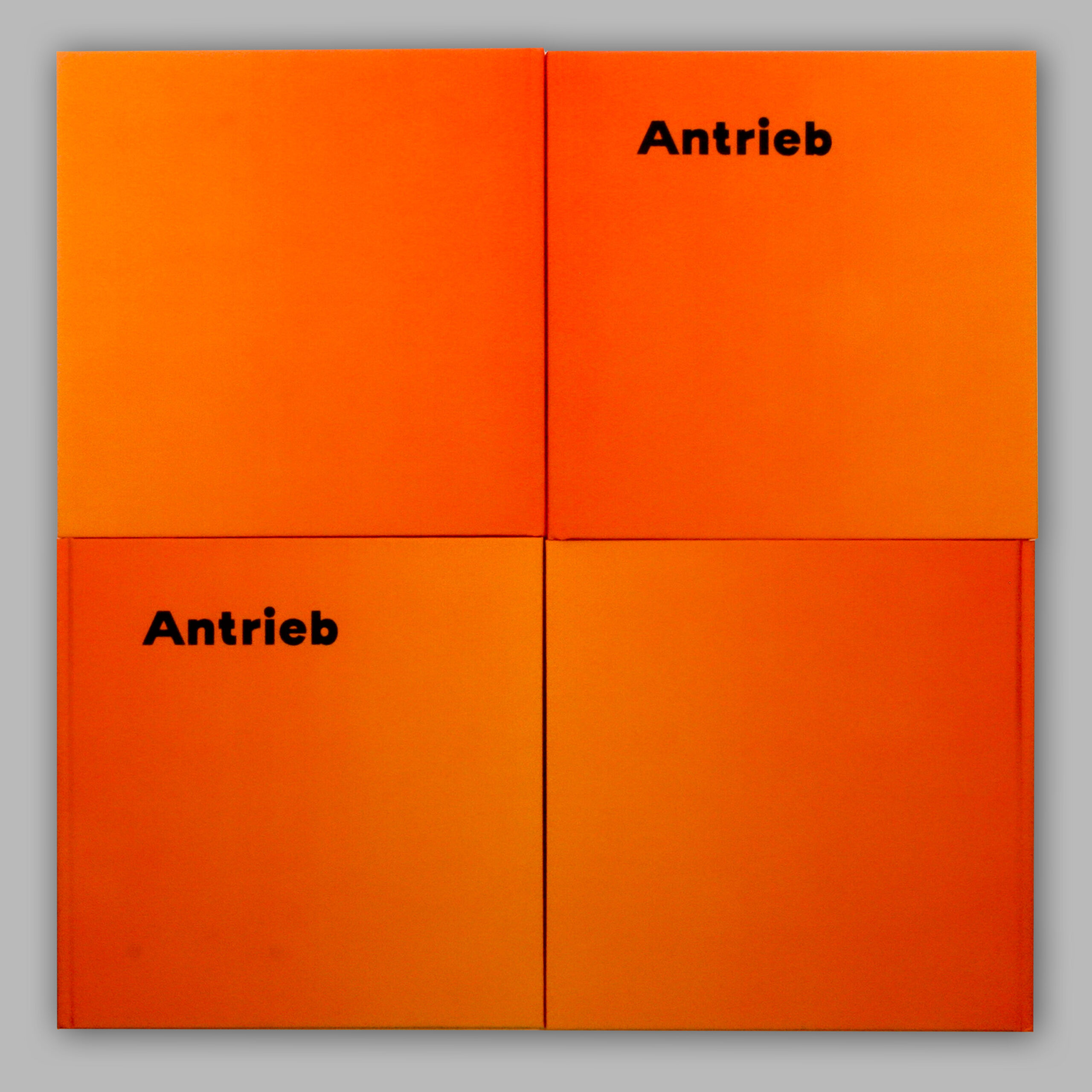
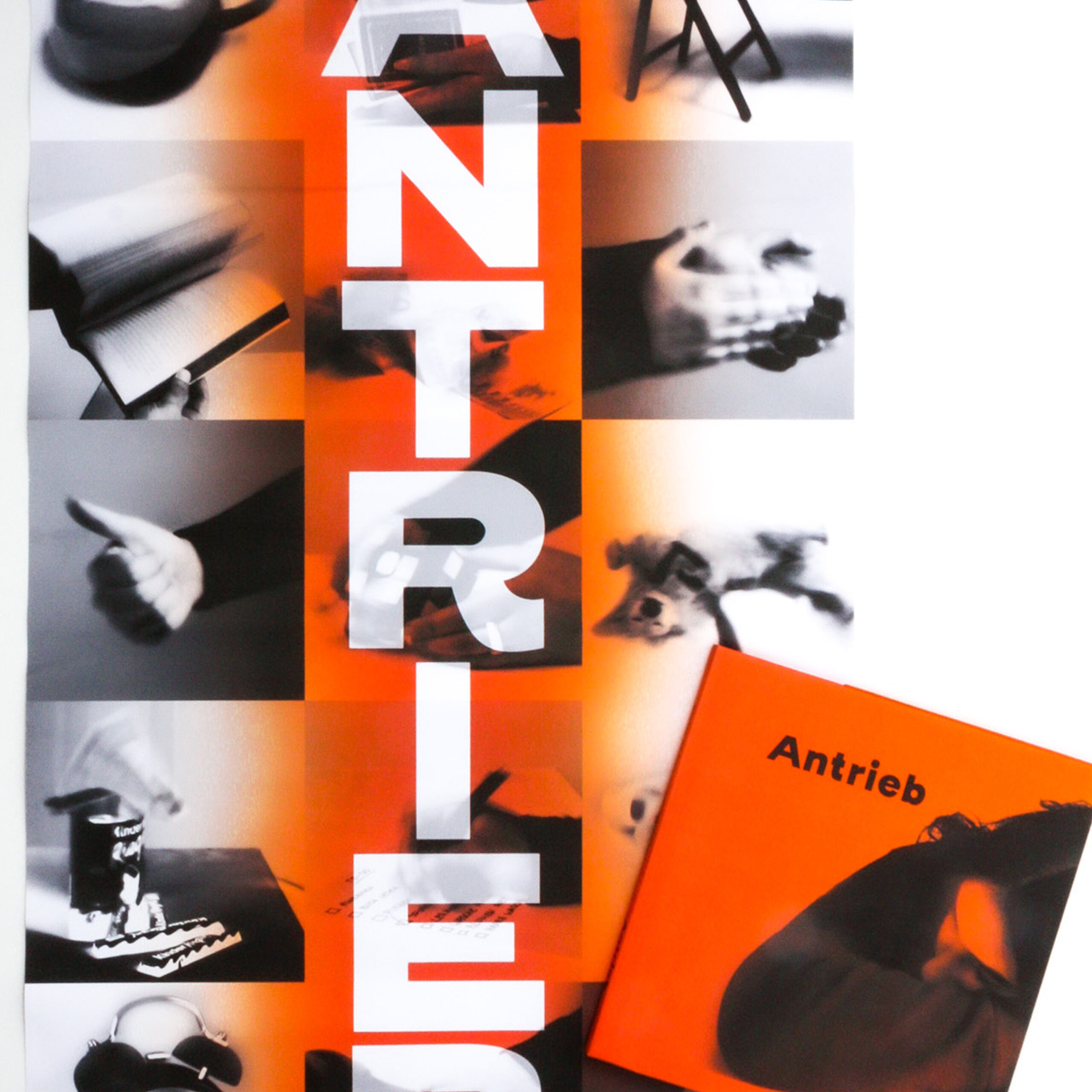
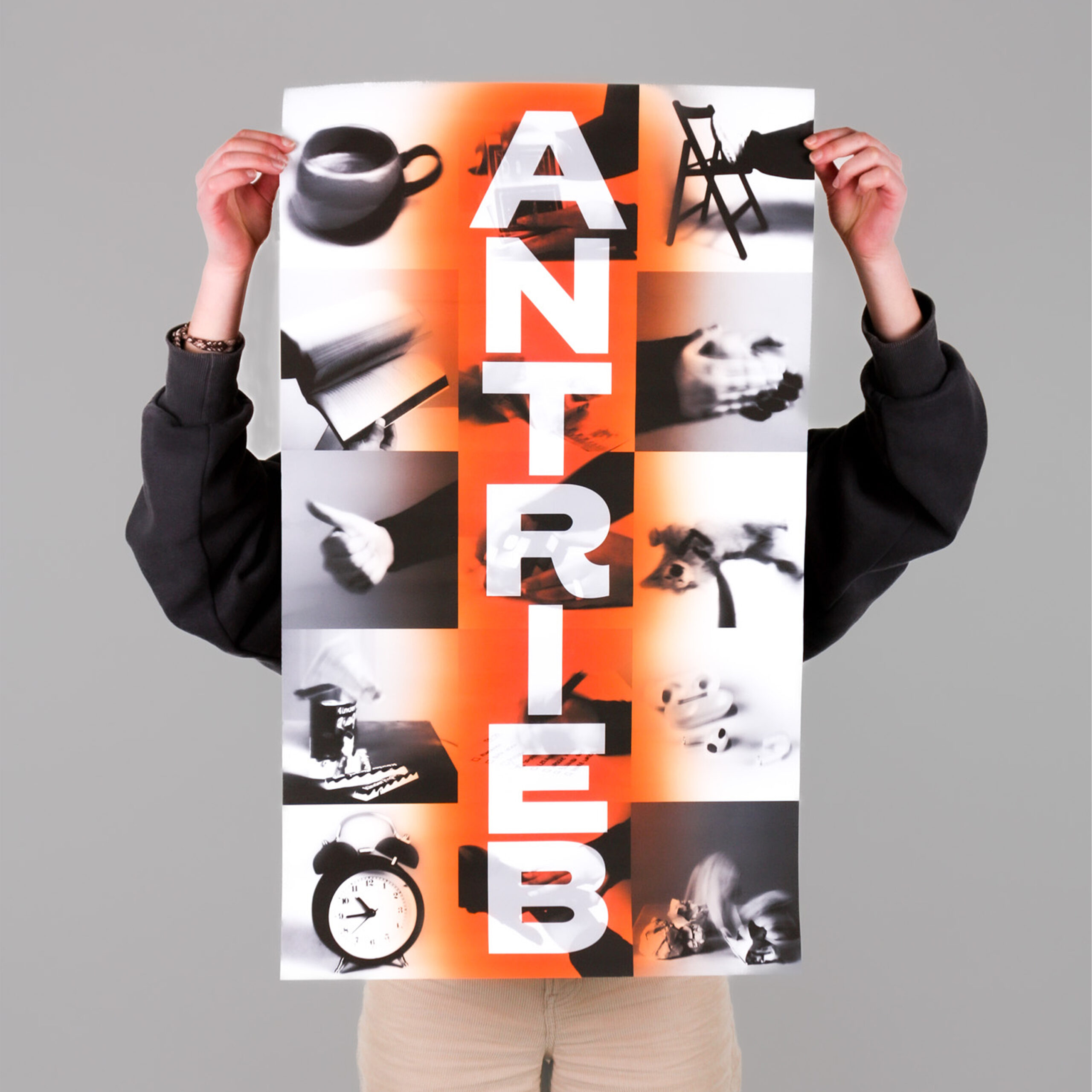
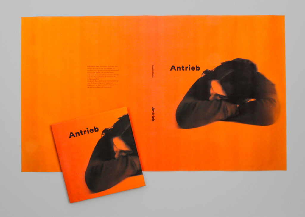
The book is designed in a square format, chosen to emphasize balance and provide equal weight to text and images. It was produced as a hardcover, combining durability with a high-quality feel. The cover is finished with a matte soft-touch lamination, reinforcing the sensory aspect of the project. Inside, the content is printed on 150 g/m² recycled paper, highlighting the project’s awareness of sustainability while offering a pleasant reading texture. In addition, the book features a fold-out dust jacket that unfolds into a poster, showcasing the title along with selected photographs from the collection.
Reproduction
Process
The project began with extensive research into motivational strategies and the development of a clear concept for a book that collects everyday objects as sources of drive. Initial experiments explored illustrations as the primary visual language, but this approach was later replaced by blurred photography, which conveyed movement and energy more effectively. Parallel to the visual exploration, texts were written to accompany the objects, supported by the selection of a color palette that reflected motivation and positivity. Once content and visuals were defined, the focus shifted to layout. A flexible grid system was established to structure the 50 entries, balancing text-only and text-image spreads. Finally, the book’s title and cover design were developed, complemented by a fold-out dust jacket that doubles as a poster, extending the project beyond the book itself.
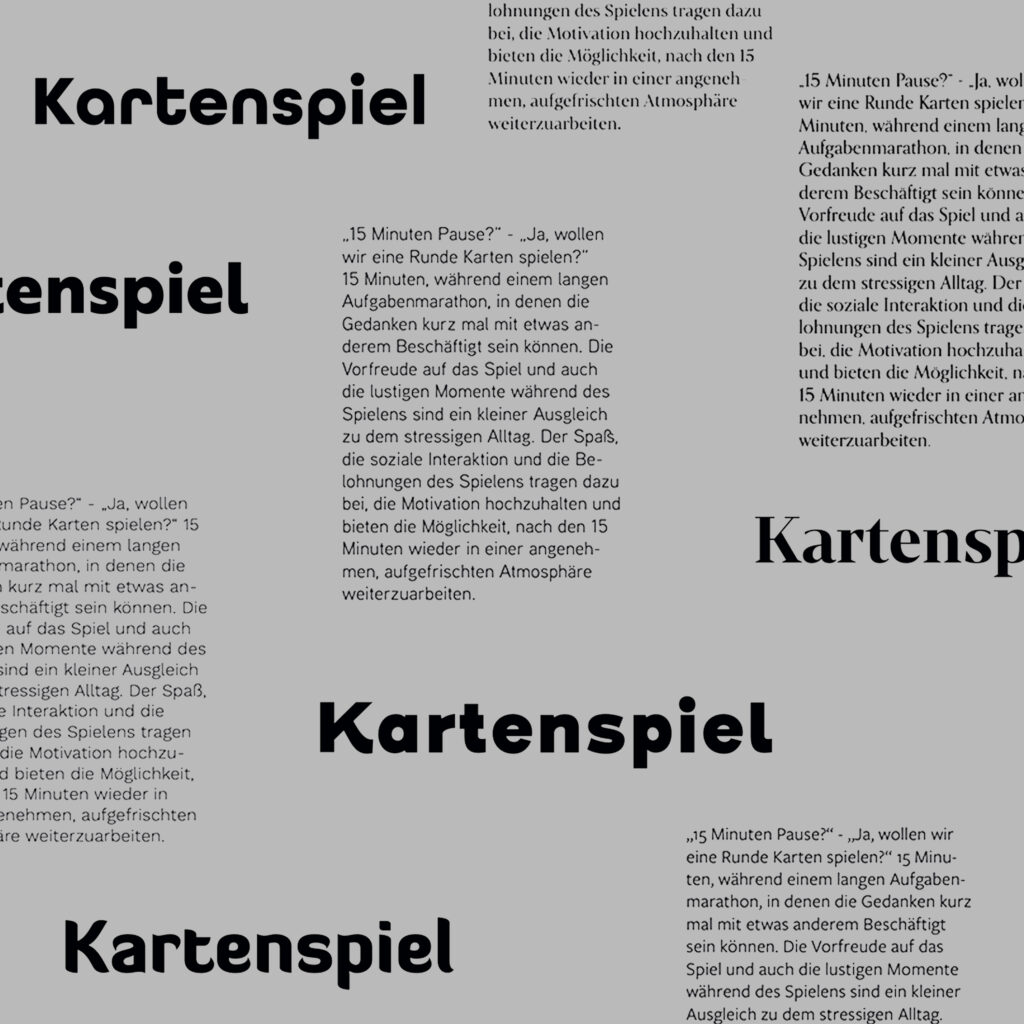
Typography
In the design phase, several different typefaces were tested to find a suitable balance between readability, expression, and hierarchy. After comparing multiple options in layout tests, the final choice settled on Orpheus Pro (Medium, 14 pt) for the body text, and Henderson Sans (Basic Black, 60 pt) for headings, creating a strong visual anchor. This combination provided both clarity and character, reinforcing the book’s rhythm and structure.
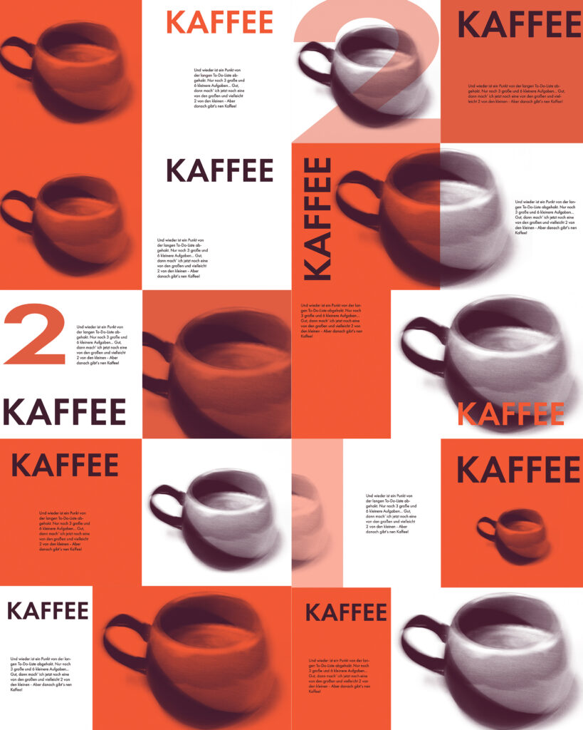
Layout tests
In the layout development phase, different combinations of text, headings, and images were tested to find a system that best conveyed rhythm and clarity. These experiments explored variations in scale, spacing, and alignment to define how text and visuals could interact without overwhelming each other. Through this iterative process, a balanced structure emerged that allowed each object to stand out individually while maintaining consistency across the entire book.
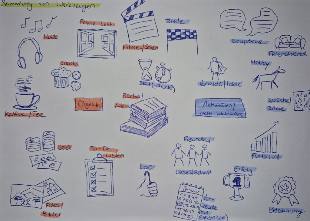
First ideas
The process began with collecting initial ideas for motivational objects, both personal and from the surrounding environment, friends and family. These were organized in a mind map to test which could be represented visually and which might be better conveyed through text.
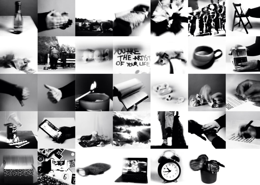
Photography
A broad range of objects was photographed to capture their motivational potential, both in direct and abstract ways. The images were converted into black and white to create consistency and stripped of their backgrounds, producing miniature-like versions that could be flexibly integrated into the layout. This approach gave the visuals a cohesive aesthetic while allowing the focus to remain on the symbolic meaning of each object.
Structure
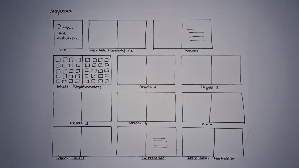
To establish the flow of the book, a storyboard was created on paper at an early stage. It mapped out the introduction, the sequence of objects, and the closing sections, providing a framework for how content and visuals would interact. This structured plan offered guidance throughout the design phase and ensured a coherent reading experience across all 50 entries.
Layout Areas
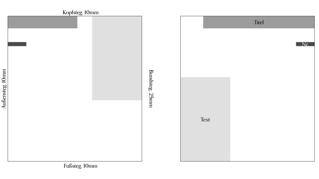
The page layout was defined with margins of 10 mm for top, outer, and bottom edges, and 25 mm for the inner margin. Titles always appear at the top outer corner, with the object number directly below. The accompanying text is placed along the inner margin, either at the top or bottom depending on the length of the title. Images follow on the next page, guided by an arrow placed next to the object number.
Get in touch!
©Sophie Doma
2025 portfolio
7th semester, hs hof
Communication Design