food feelings
This project explores how design and interaction can raise awareness
around sensitive health topics. Food Feelings is a poster series with an additional app and instagram, created to address eating disorders, particularly among teenagers and students. By combining analog and digital media, the project demonstrates how design can open up conversations, provide accessible information, and create a supportive space that bridges education with empathy.
This project explores how design and interaction can raise awareness around sensitive health topics. Food Feelings is a poster series with an additional app and instagram, created to address eating disorders, particularly among teenagers and students. By combining analog and digital media, the project demonstrates how design can open up conversations, provide accessible information, and create a supportive space that bridges education with empathy.
Description
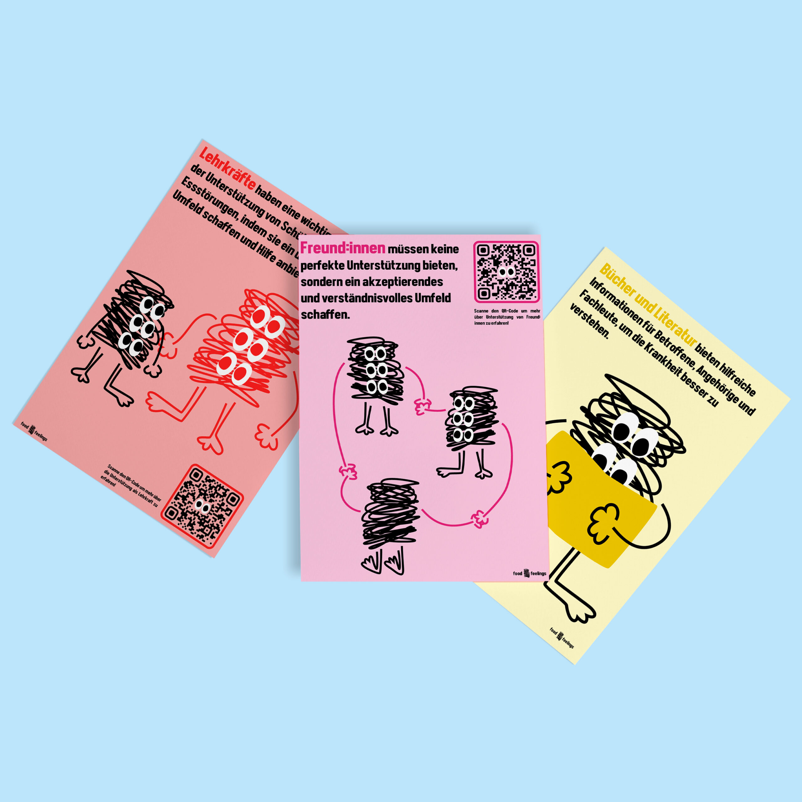
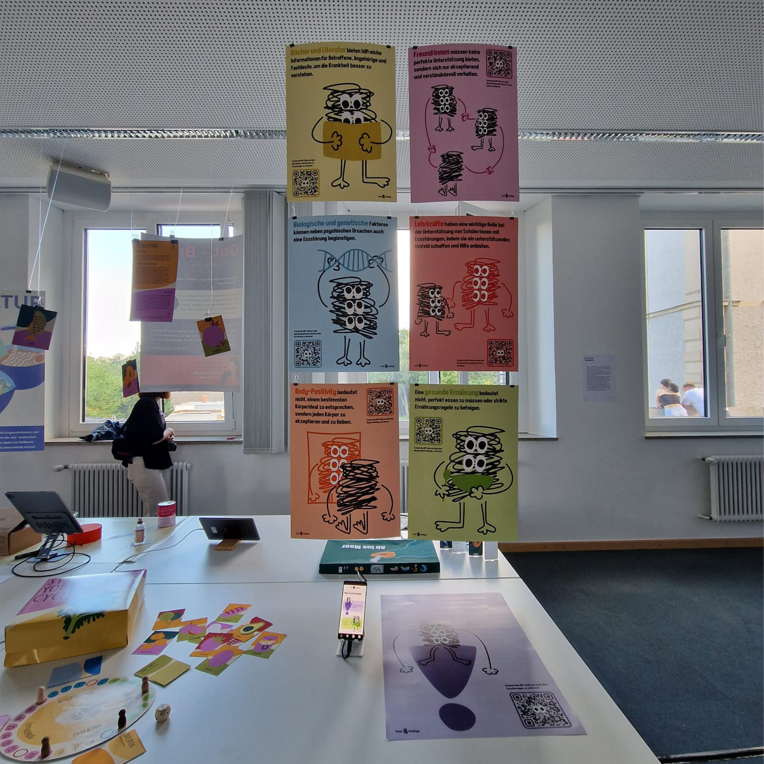
Food Feelings focuses on raising awareness about eating disorders among young audiences in schools. The project consists of seven posters, each placed in thematically relevant locations and featuring QR codes that link to a web app with more detailed content. A central character visually guides the topics, from body positivity to mutual support, with each subject assigned its own color for consistency across posters and digital media. The content was refined in collaboration with the Bundesfachverband Essstörungen e.V. and extended through the Instagram account @food.feelings.official, offering additional resources, tips, and challenges. Together, the posters, app, and social media presence form a multi-layered communication strategy that is both informative and empathetic.
4th Semester, mar 24 – jul 24, interaction design
core Idea
Eating disorders are complex mental illnesses characterized by disordered eating behaviors, distorted body image, and emotions like anxiety, shame, and loss of control.The project aims to explain the different types, causes, and effects of eating disorders, while also highlighting possible treatment options. By combining posters, a web app, and social media, the project provides accessible information in a way that is both educational and empathetic, supporting not only those affected but also their friends, families, and teachers.
Users
The primary audience consists of children and teenagers aged 10 to 18, who are at a particularly vulnerable stage for developing eating disorders. The project seeks to provide them with clear, age-appropriate information that breaks down complex medical and psychological aspects into accessible language and visuals. Secondary users include friends and classmates, who often play a key role in early recognition and support, as well as parents, family members, and teachers, who need resources to better understand the issue and guide young people toward professional help.
Format & media
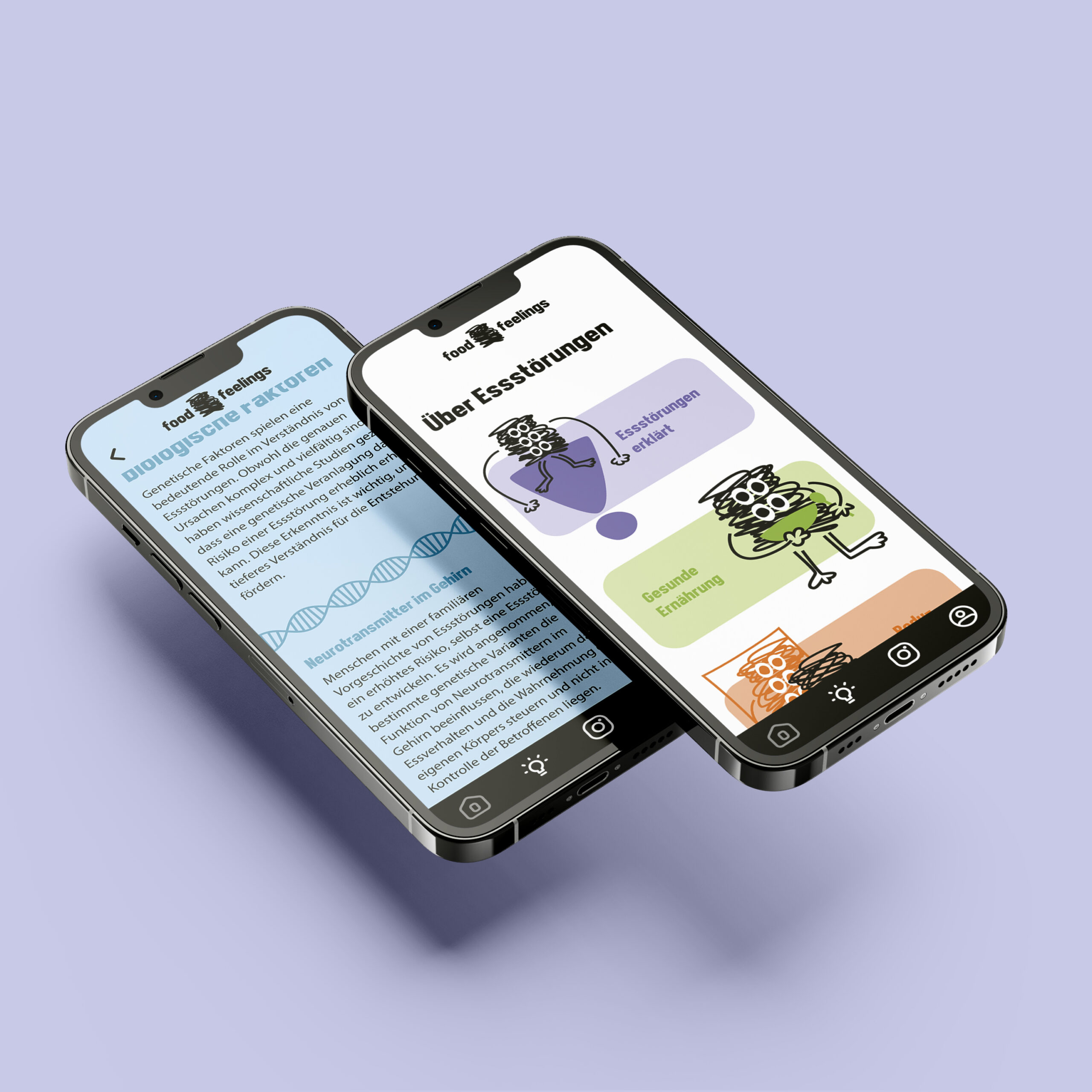
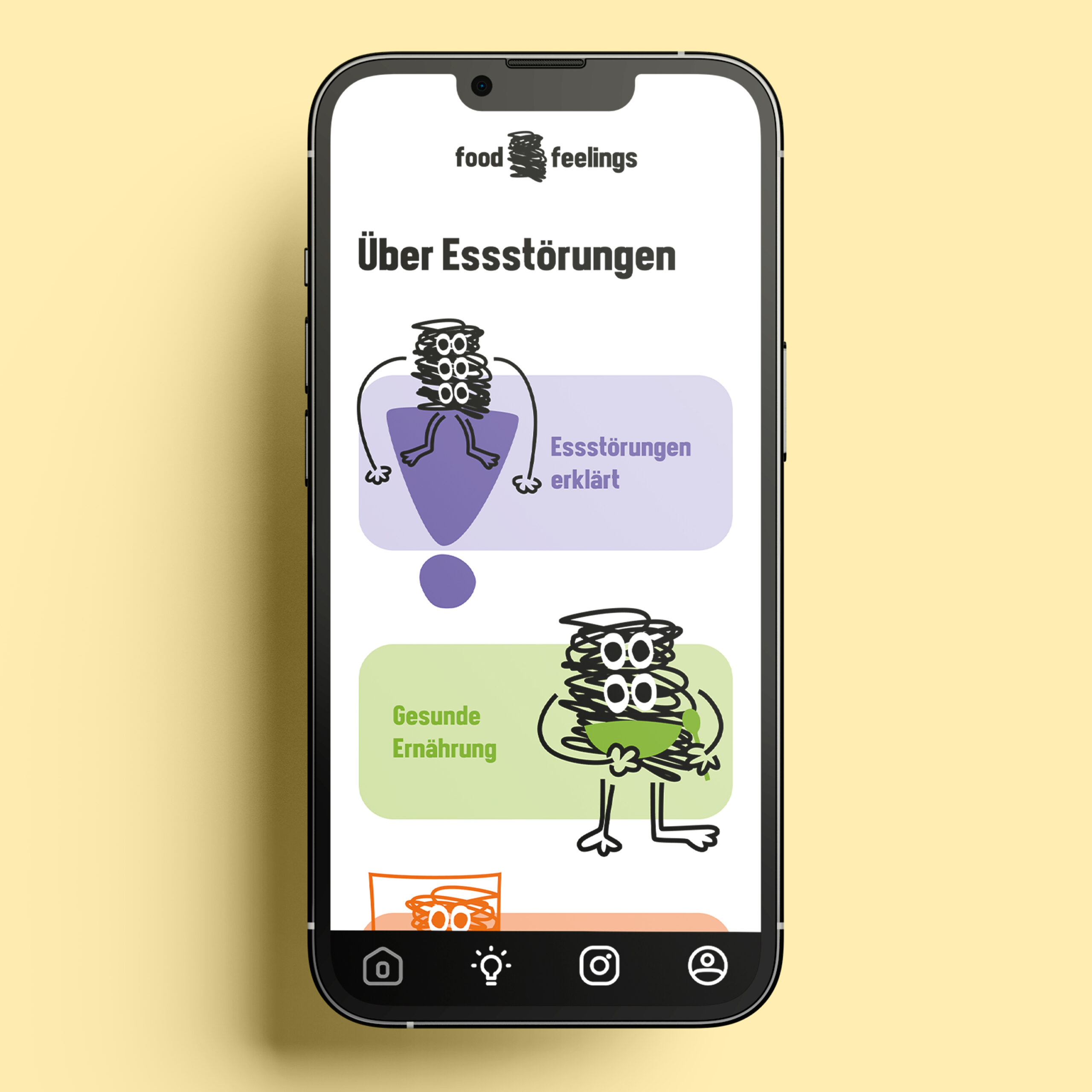
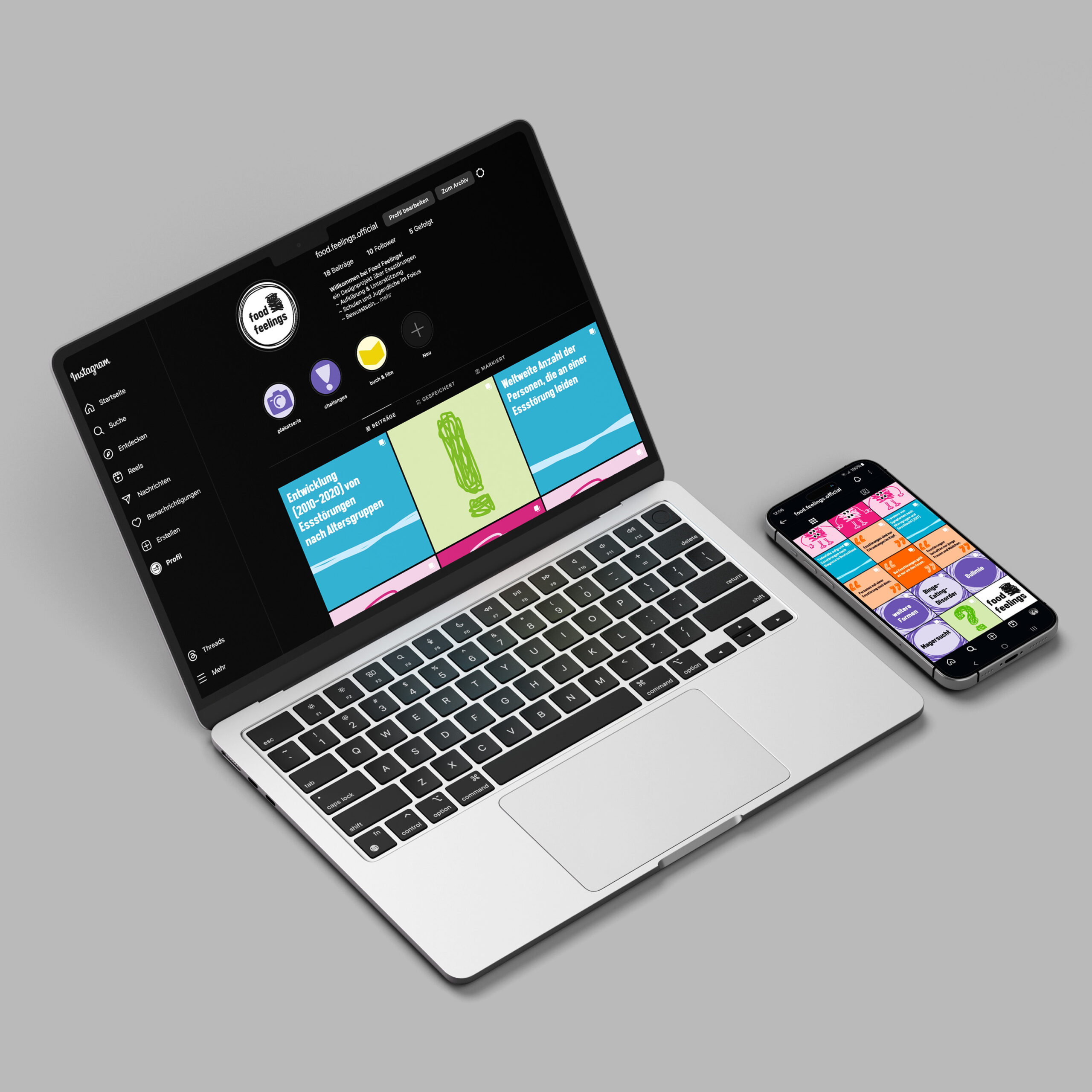
The project combines three main elements: a poster series with seven thematically placed designs across the school, each linked to a web app through QR codes; a digital platform that extends the information with animations, resources, and gamification features; and an Instagram account that provides ongoing content such as statistics, tips, challenges, and recommendations. All elements are connected through a consistent visual identity, color coding for each topic, and the guiding character.
Screencast
Process
The project followed a structured process that balanced design exploration with implementation and exhibition planning. In the design phase, the focus was on finalizing the poster series, refining the app, creating animations, and preparing content and visuals for Instagram. Each element was developed iteratively, ensuring coherence across media while keeping the target audience in mind. Once the design foundation was in place, the implementation phase concentrated on production and technical realization. This included printing the posters, developing a functional app prototype for mobile devices, and launching the Instagram account to extend the project’s reach.
Illustrations
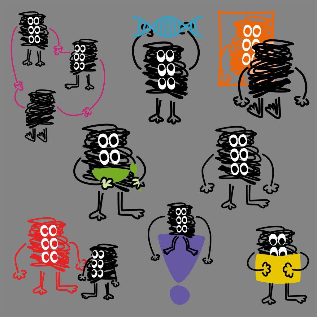
The project is guided by a character, who appears in different scenarios to visualize the various topics. For example, he stands in front of a mirror to embody body positivity, joins hands with friends to symbolize support, or interacts with books and classrooms to highlight education and knowledge. By adapting to each situation, he/she provides an approachable and relatable figure that makes complex topics more accessible for young audiences.
Function Map
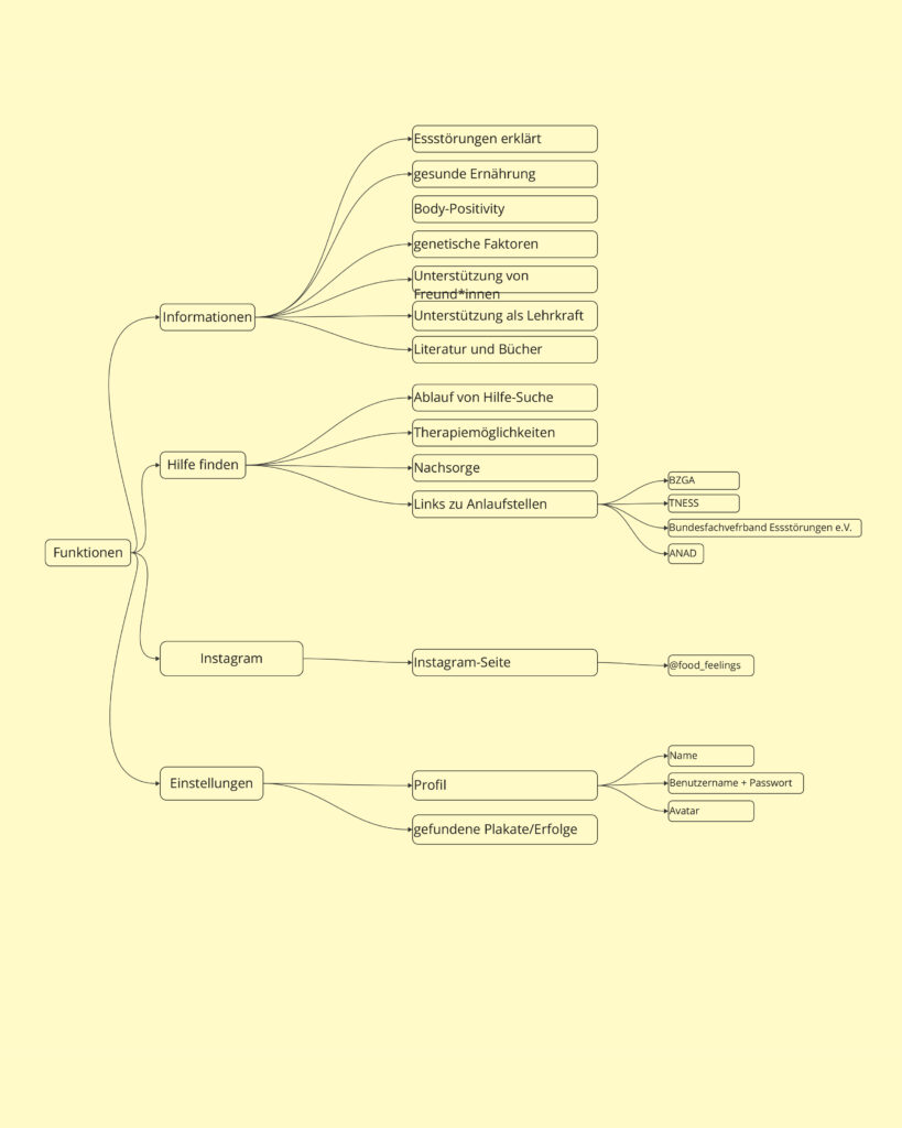
A detailed function map defines what the app should include and how it could complement the poster series. This helped structure the content into clear areas: an information section covering seven core topics, a help section with therapy options and links to institutions, an Instagram integration, and a profile area with gamification elements. This early step clarified the app’s requirements and ensured a consistent user experience across physical and digital touchpoints.
Concept
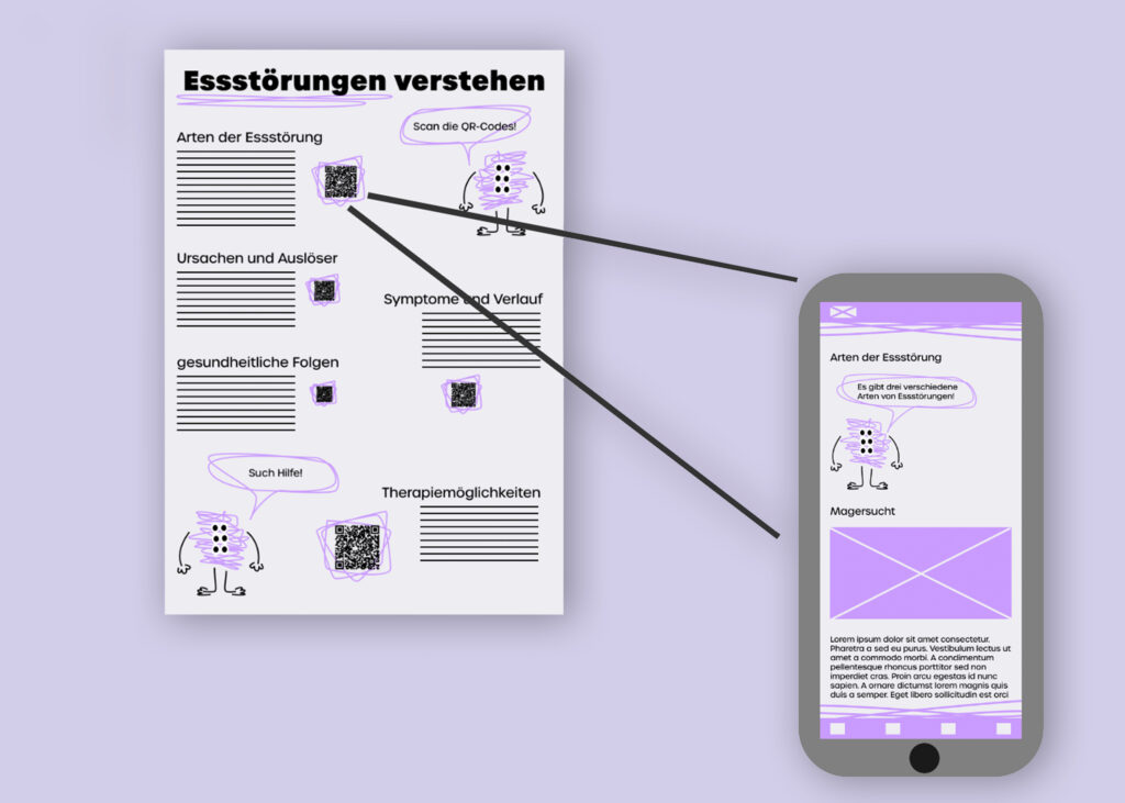
The project combines a poster series with a complementary web app. Seven posters, each assigned to a specific theme and location within the school, introduce the key topics. QR codes on the posters link directly to app sections that expand the content with multimedia elements and practical resources.
User Flow
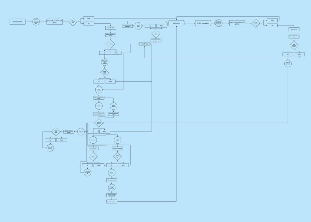
The user flow begins with encountering one of the posters in everyday school spaces such as the cafeteria, gym, or biology classroom. Scanning the QR code opens the related app section, where users can engage with more detailed information, animations, and resources. The app also guides users to further support, such as counseling options. Finally, the Instagram channel extends the flow by offering ongoing challenges, tips, and community interaction.
Styleguide
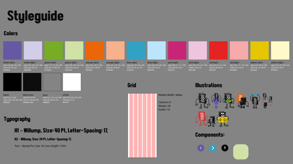
The styleguide defines the project’s visual system. It uses a vibrant palette of distinct colors (violet, green, orange, blue, pink, red, and yellow, each in light and dark) to differentiate the seven themes. Typography combines Willump for headings with Myriad Pro for body text, ensuring a mix of bold character and legibility. A six-column mobile grid provides structure, while illustrations of the protagonis bring consistency and personality to all media.
Moodboard
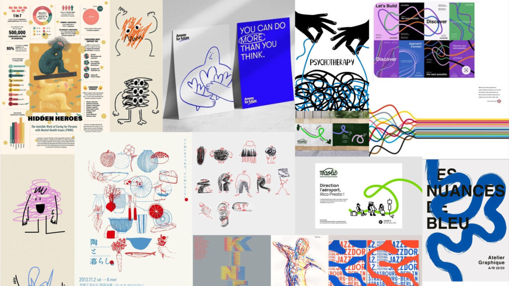
The moodboard explored a hand-drawn, sketch-like style with simple lines and minimalistic forms, combined with a soft color base of white and beige. Red and blue accents were introduced to create contrast and highlight important information. This approach influenced the final character design and visual tone, balancing approachability with clarity.
Get in touch!
©Sophie Doma
2025 portfolio
7th semester, hs hof
Communication Design