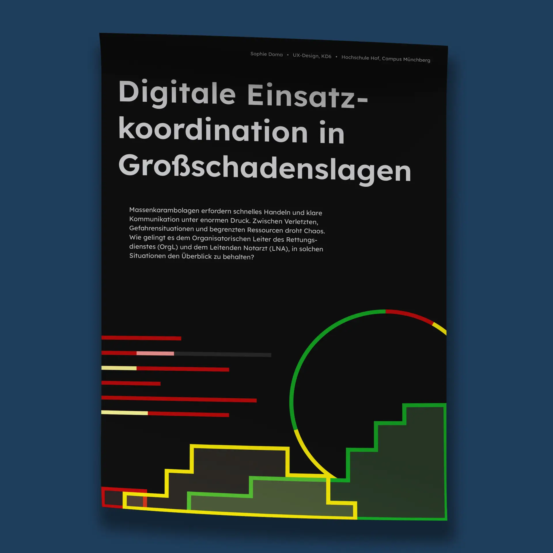
RESCUE
This project aims to digitally support emergency teams in complex operations, especially mass-casualty incidents. The primary users are the EMS organizational
leader and the Lead Emergency Physician, each using a role-specific but similar application. Key features include a shared dashboard, live map, and patient and incident management. The project was developed in the 6th semester as part of the UX/UI design course, based on an expert interview with the ILS Bayreuth/Kulmbach and validated in usability tests with the BRK Kreisverband Kulmbach.
This project aims to digitally support emergency teams in complex operations, especially mass-casualty incidents. The primary users are the EMS organizational leader and the Lead Emergency Physician, each using a role-specific but similar application. Key features include a shared dashboard, live map, and patient and incident management. The project was developed in the 6th semester as part of the UX/UI design course, based on an expert interview with the ILS Bayreuth/Kulmbach and validated in usability tests with the BRK Kreisverband Kulmbach.
Description
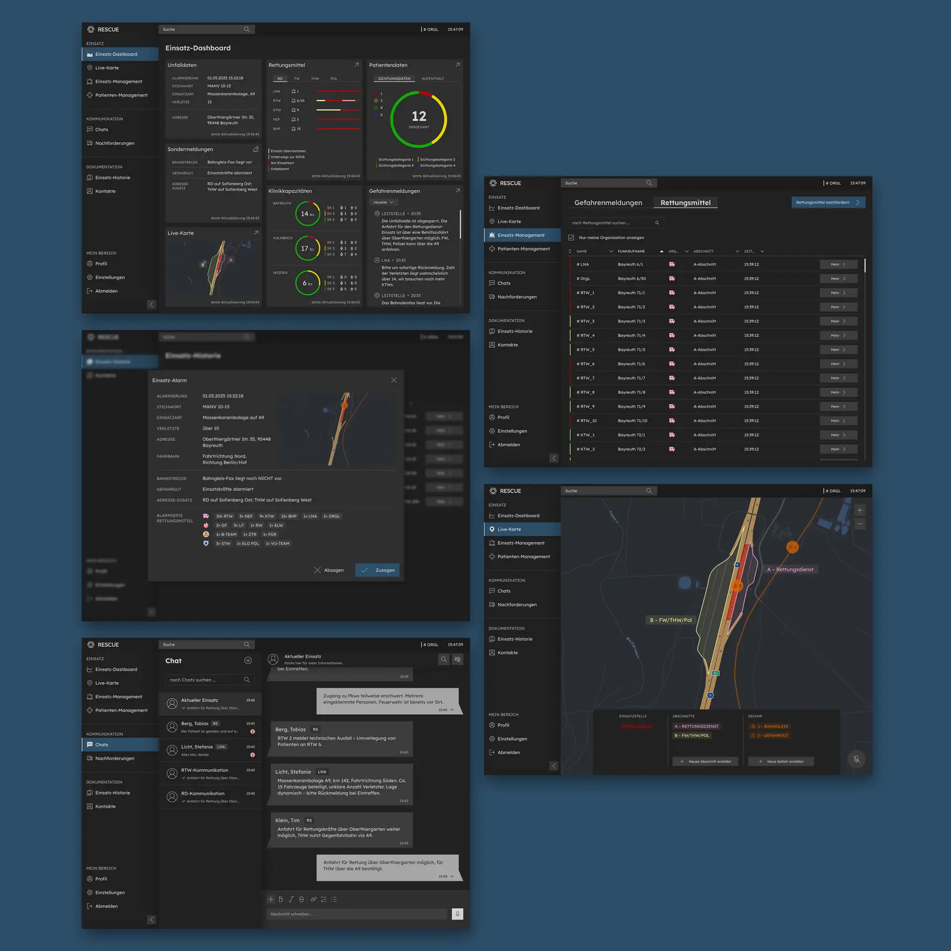
RESCUE is a digital application designed to support emergency teams in mass-casualty incidents. It provides role-specific tools for the EMS organizational leader and the Lead Emergency Physician, including a shared dashboard, live map, and patient management. Developed in collaboration with ILS Bayreuth/Kulmbach and validated in usability tests with BRK Kulmbach, the project replaces manual processes with a more efficient and coordinated workflow. This application is intended to simplify communication while enhancing collaboration, coordination, and decision-making under extreme conditions.
6th Semester, mar’ 25 – jul’ 25, Ux/ui design
core Idea
The core idea emerged from the challenge of maintaining an overview during complex emergency operations. Time is critical, yet manual processes such as paper notes slow down coordination and increase the risk of errors. The vision was to create a digital tool that supports both organizational and medical leaders by giving them access to the same, up-to-date information. By streamlining communication, providing a shared dashboard, and simplifying workflows, the application aims to reduce complexity, save time, and ultimately improve patient outcomes.
Users
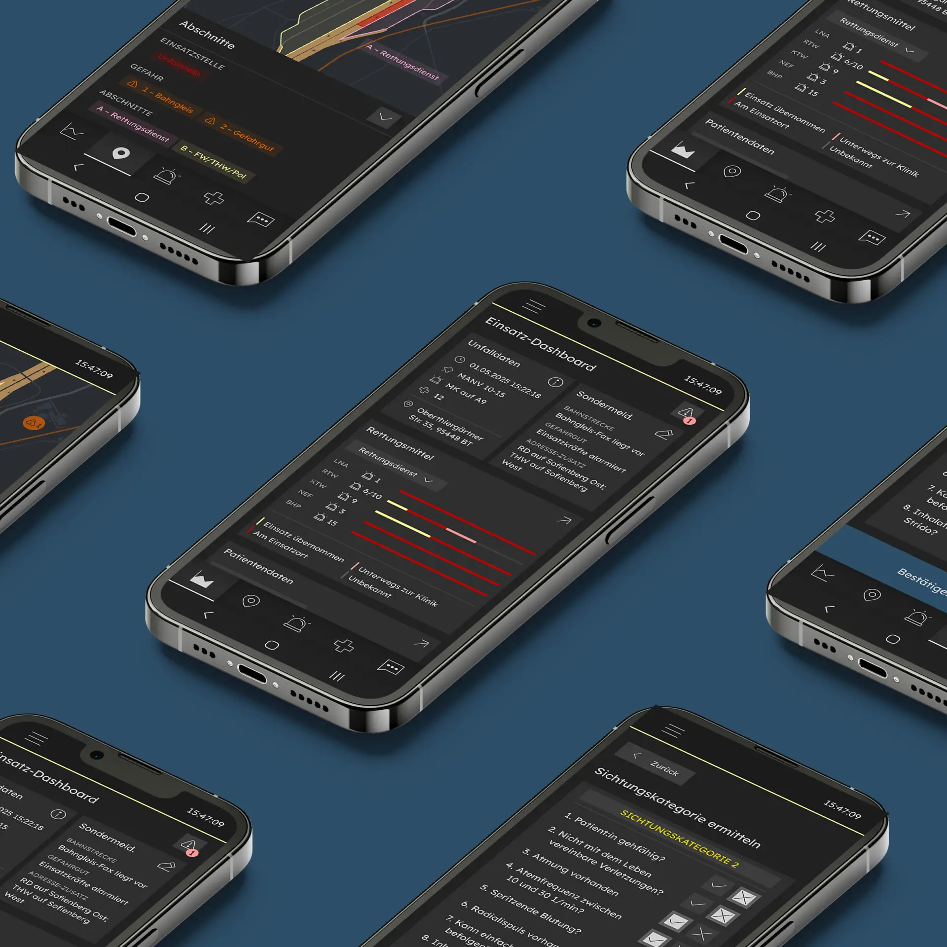
RESCUE is tailored to two key user groups: The Emergency Medical Services organizational leader („Organisatorischer Leiter des Rettungsdienstes” = OrgL) and the Lead Emergency Physician („Leitender Notarzt” = LNA). Each has distinct areas of responsibility: the OrgL focuses on the organization and logistics of the operation, the LNA serves as the on-site medical lead. However, both face similar challenges: the lack of a unified overview, the prevalence of manual processes such as the reliance on paper-based methods, and the resulting inability to work efficiently.
Solution
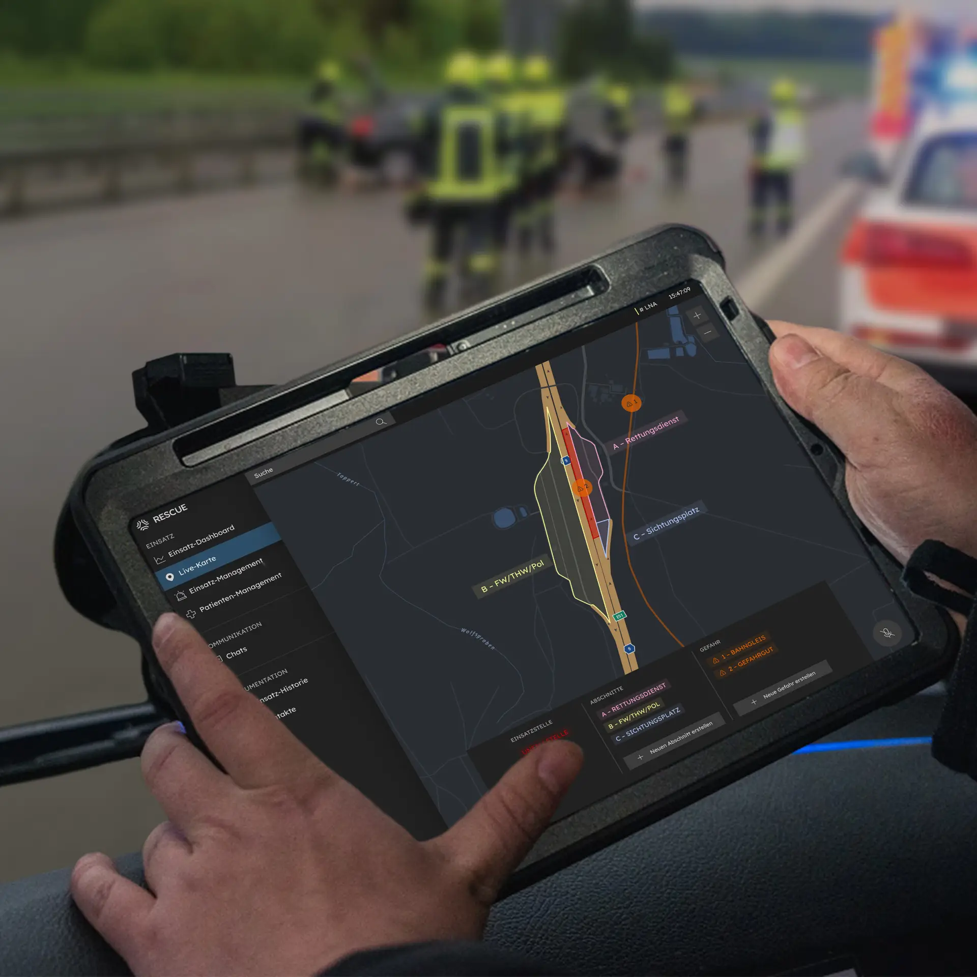
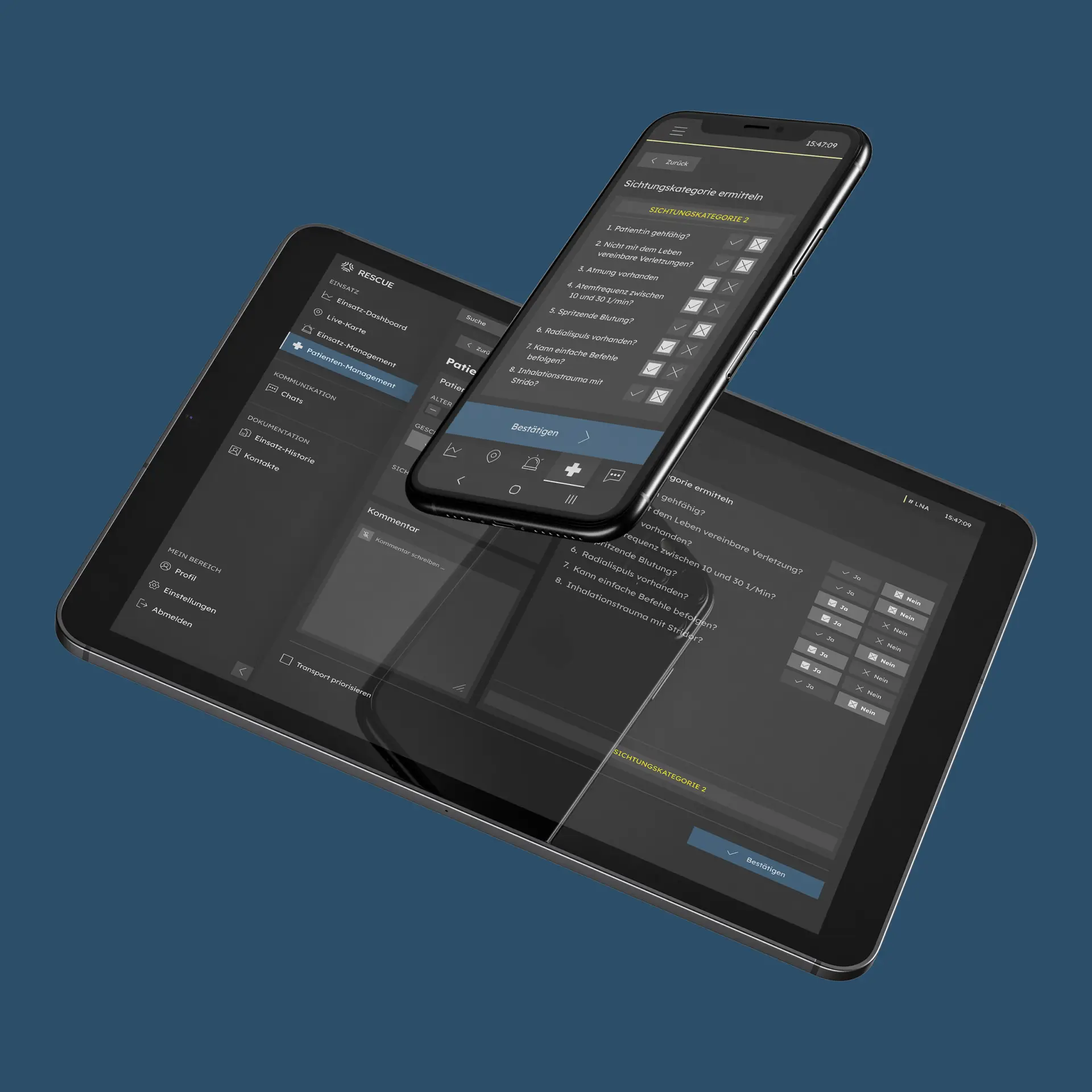
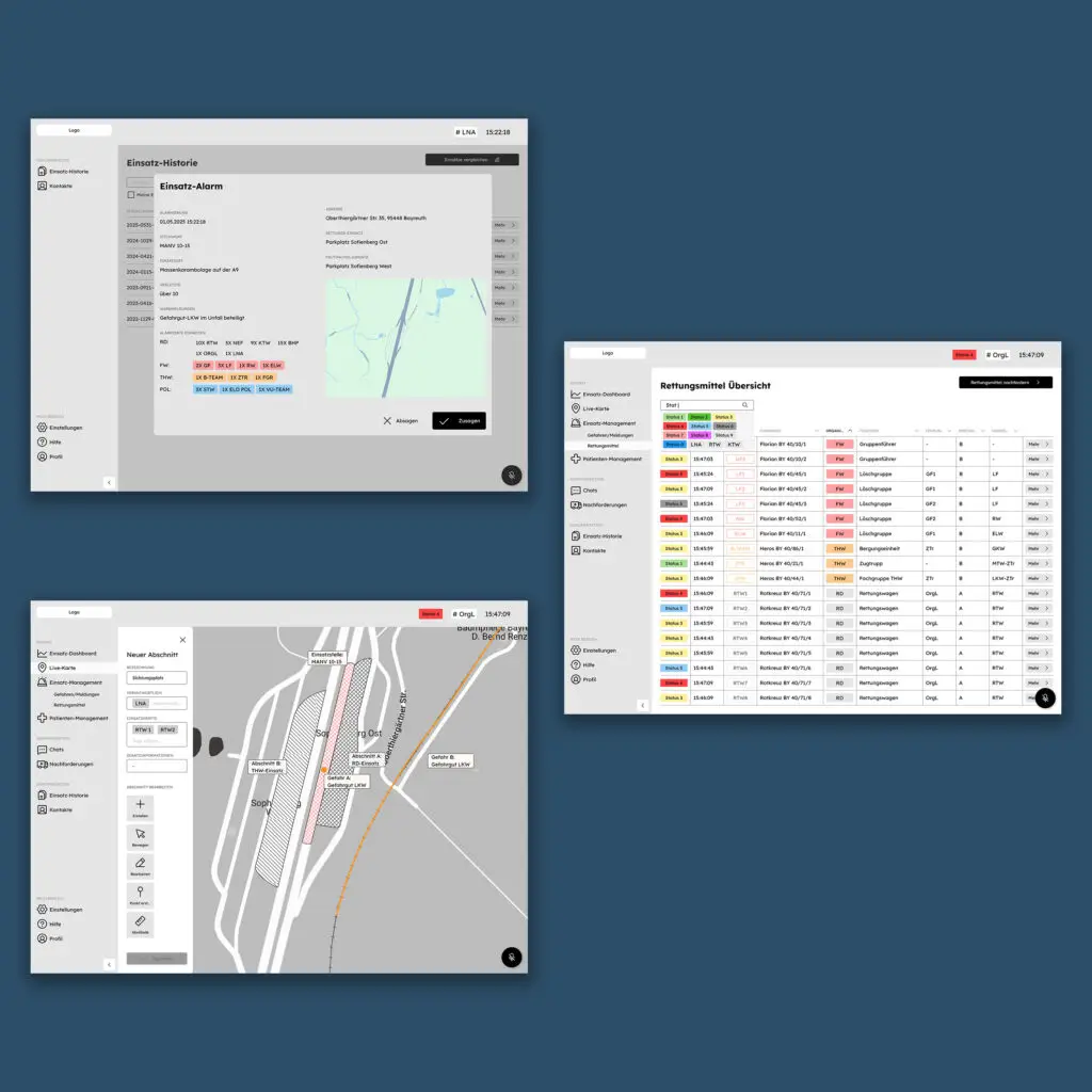
The solution is a tablet-first application with selected functions available on mobile for maximum flexibility. It streamlines workflows across the phases before, during, and after an operation, like alerting, role-specific on-site tasks, and finally, documentation and evaluation. Insights from expert interviews and usability testing shaped the design, ensuring practical relevance. The process included research, wireframing, prototyping, and iterative testing. Tools used: Figma for interface design and prototyping, Miro for research, mapping user journeys and sketching user flows.
Screencast
Process
The development of RESCUE followed a structured, user-centered design process divided into four phases: research, definition, design, and prototyping. The project began with desk research to understand existing practices and limitations in mass-casualty response. This was followed by an expert interview with the ILS Bayreuth/Kulmbach, which provided valuable insights into real-world workflows and helped define the primary user groups. Based on this input, a detailed user journey was created, covering the phases before, during, and after an operation. Initial wireframes were then developed to visualize potential solutions and interaction patterns. These were tested in an usability testing with an OrgL and an LNA from BRK Kulmbach, leading to refinements in navigation, structure, and information flow. The final stage focused on the design and prototyping, realized through a component-based system to ensure consistency and scalability.
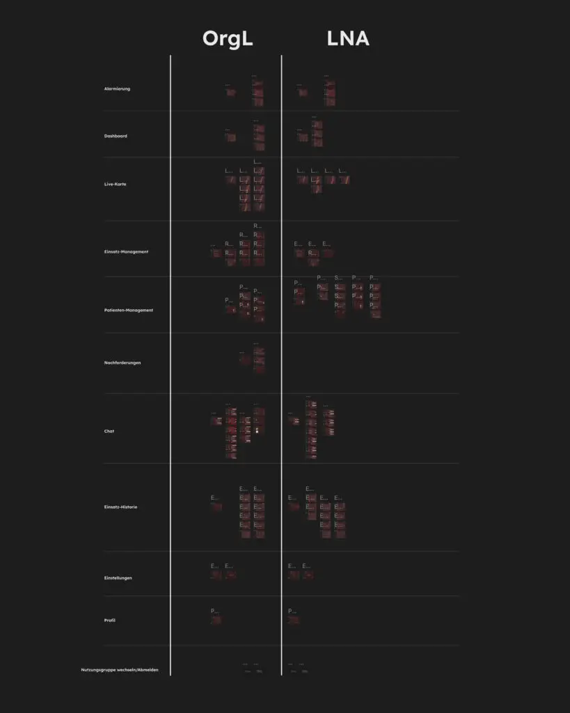
Wireframes
Based on the previously developed user stories, initial wireframes were created to visualize key usage scenarios, tailored to the specific tasks and requirements of the two primary user groups. The wireframes are structured to show both role-specific views and functions for OrgL and LNA, as well as shared interaction areas. These wireframes were tested with the OrgL and LNA from BRK Kulmbach to validate usability and refine interactions.
Figma-File
The design was realized in Figma using a component-based approach, leveraging reusable elements, variables, and styles to ensure consistency and scalability. The interface is divided into almost identical sections for the two primary roles: OrgL and LNA. This allows a role-specific adaptation while maintaining a unified look and feel. This approach streamlines updates, supports efficient prototyping, and ensures that both user experiences are coherent across the application.
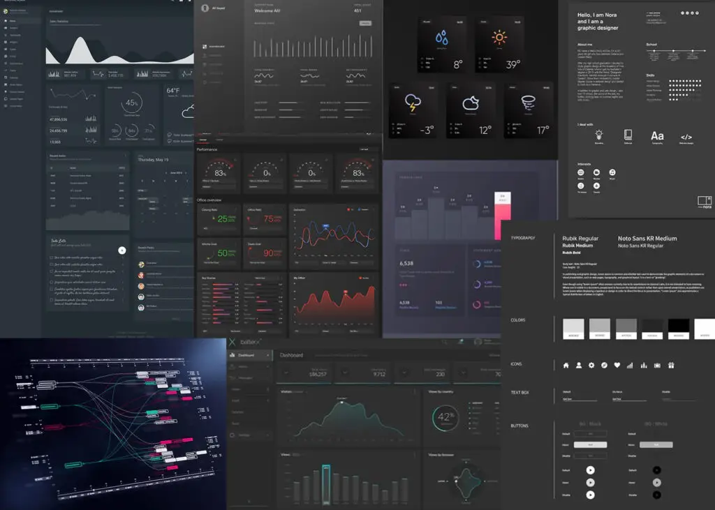
Moodboard
The moodboard conveys a professional, data-driven, and clear aesthetic. It features a dark UI with black and dark gray tones, accented selectively with signal colors to highlight critical information. Clean lines, sharp contours, and structured data visualizations reinforce a technical and precise feel.
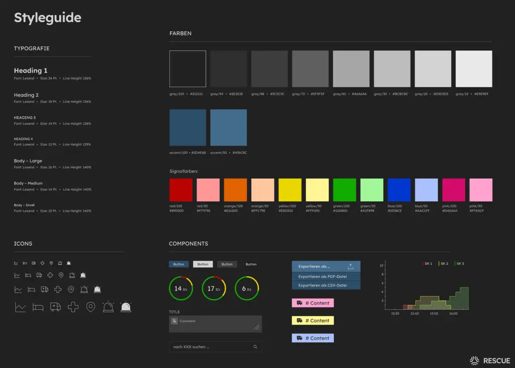
Styleguide
The styleguide is built on the Lexend typeface, featuring 7 text variants. The color system combines 8 grayscale tones with 2 accent colors for navigation states and primary actions, complemented by 6 signal colors in full and 50% intensity. A custom icon set was created in four sizes, each available in filled and outline versions. Together, the styleguide ensures a consistent, accessible, and scalable design system.
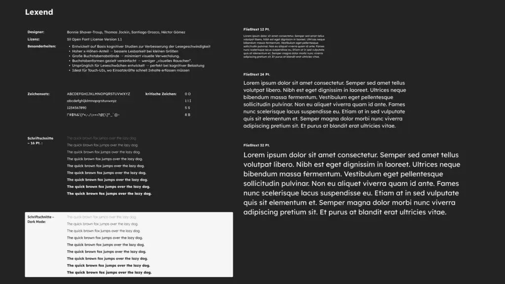
Typography
For the interface, the typeface Lexend was chosen, originally developed to support people with reading difficulties. Based on cognitive studies, it improves reading speed through wide letter spacing and simplified shapes, reducing visual noise and confusion. This makes it particularly effective under cognitive stress and in high-pressure environments.
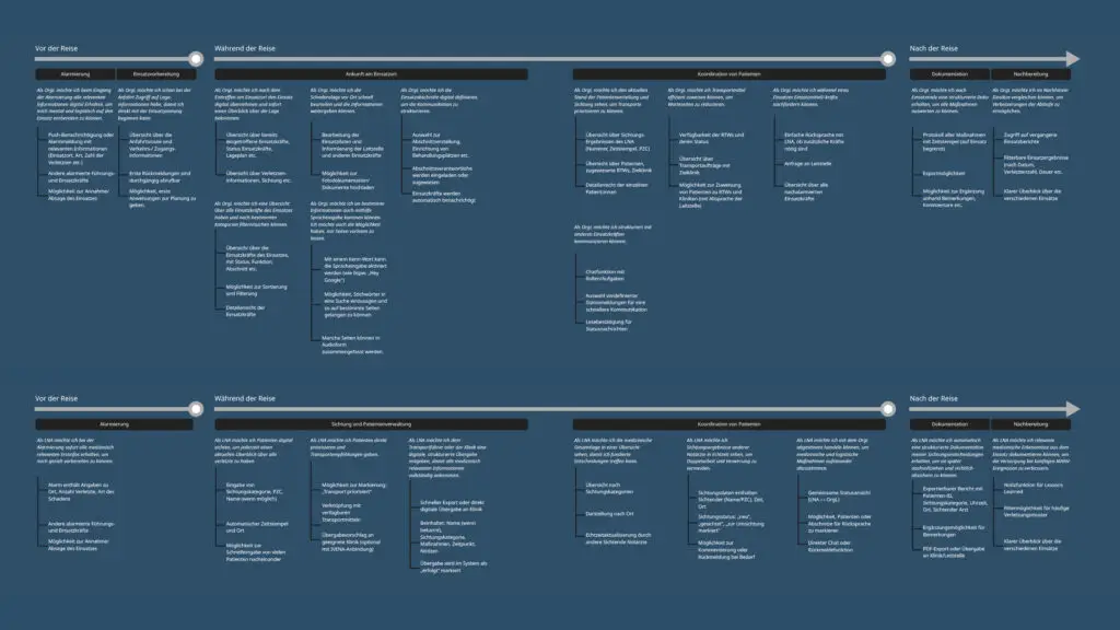
User Stories
The user stories were developed for the two primary user groups, based on real workflows and challenges during emergency operations. They are structured along the timeline of an incident: before the operation, during the operation, and after the operation. In addition, overarching stories address scenarios relevant to both roles.
Get in touch!
©Sophie Doma
2025 portfolio
7th semester, hs hof
Communication Design